Kitchen Pantry Designs We Love
If you are lucky enough to have the space for a glorious pantry, you are lucky! But even if your square footage is minimal, there are still ways to incorporate a workhorse pantry into your kitchen design.
We love a good butler’s pantry for so many reasons, but the common theme is their flexibility. They can be an entertaining prep space one day, contain a baking mess the next, and serve as coffee bar, cocktail bar, snack bar, or all of the above while holding overflow food, kitchen tools, and appliances.
Here, I’m sharing some of my favorite kitchen pantries, why they made the list, and how to maximize your own pantry space in your kitchen. Which one is your fave?
Larger Than Life Kitchen Pantries
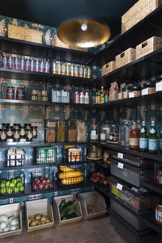
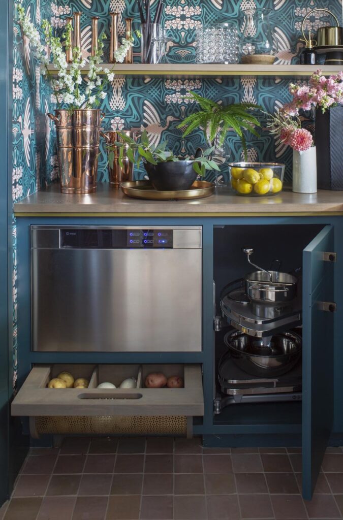
This kitchen pantry is one of my favorites because it brings lots of style and functionality together in one space. I designed this for the House Beautiful Whole Home Concept House in Colorado and immediately fell in love with the wallpaper from Spoonflower. We customized the paper to coordinate with the color of the cabinets. The mix of materials includes open shelves, brass, and a custom wood countertop with metal details from Grothouse. This pantry is actually two separate spaces. One area was designated for a possible elevator and featured easily removable adjustable shelves for all of the pantry essentials while this one includes a second sink, produce storage, and a lazy susan to utilize every square inch of space for cookware.
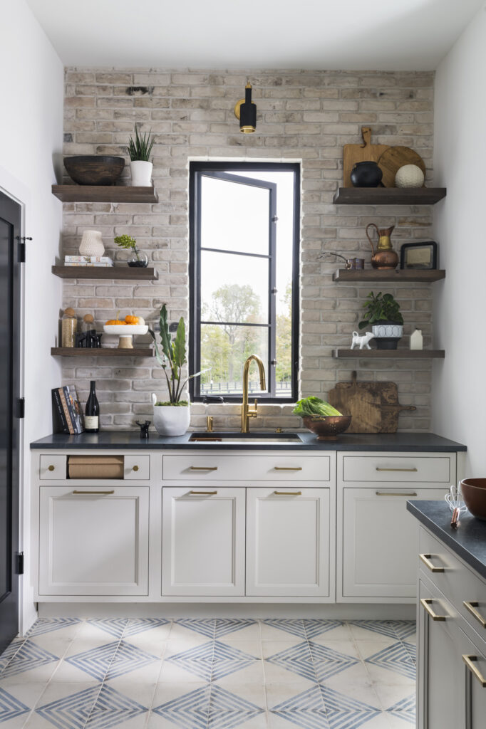
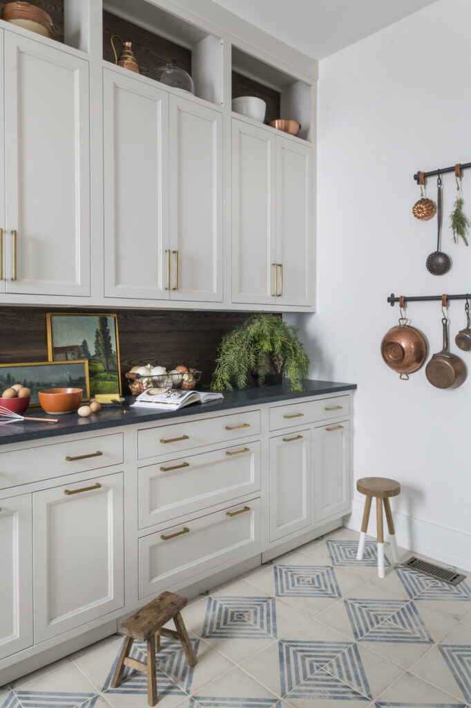
This is what I like to call a “back kitchen” but it also serves as a pantry. This design was part of our Home on a Nashville Hill kitchen design. It has almost everything the main kitchen has (a sink, plenty of storage, a dishwasher, etc.) however, it is behind doors and a place where you can leave the “dirty” dishes for a dinner party behind. It also has a ton of storage for items you would place in a pantry, including a small walk-in pantry!
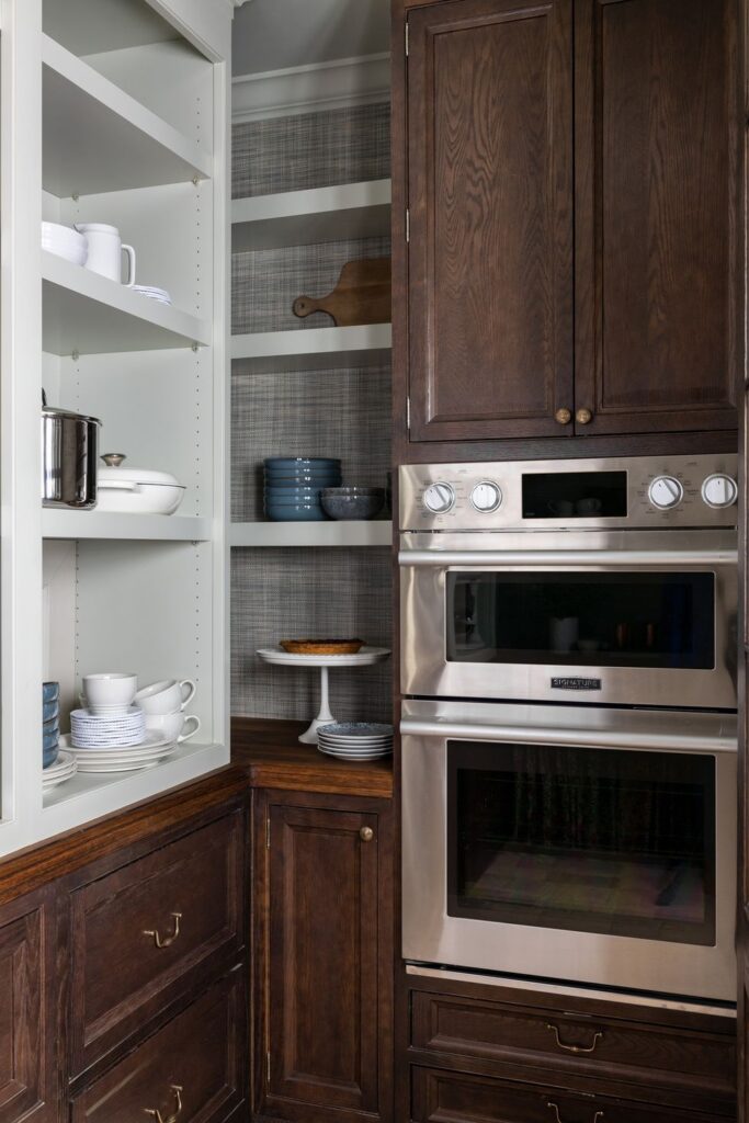
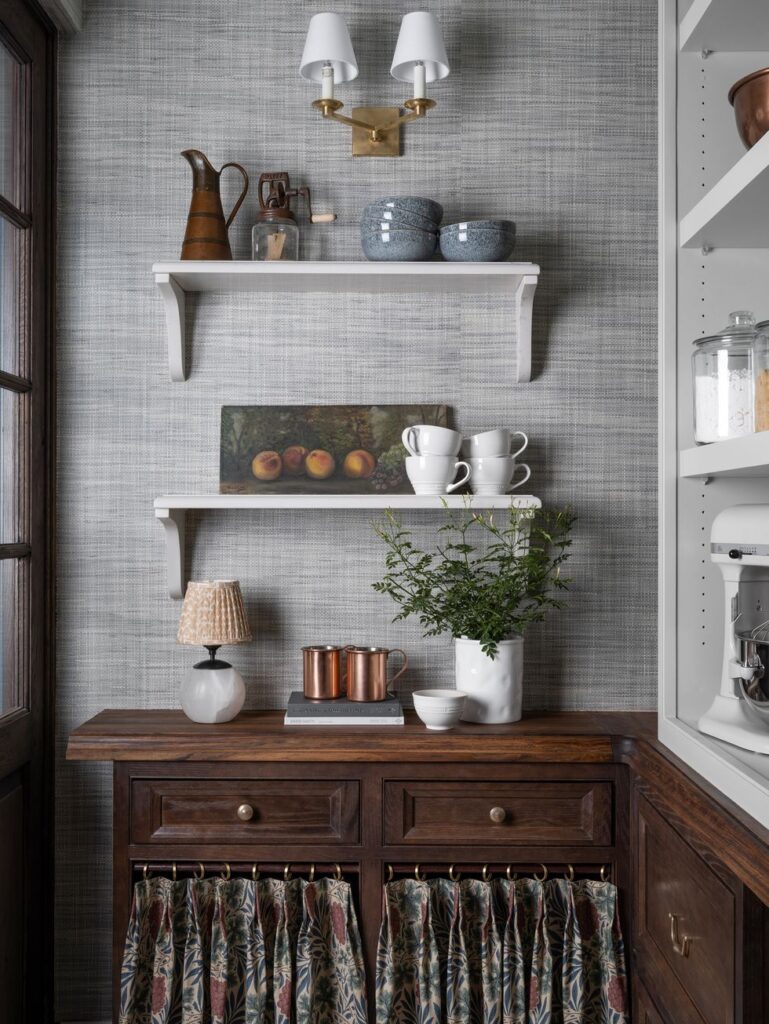
You may have spotted this kitchen pantry by designer Whittney Parkinson for the House Beautiful Whole Home 2022.in our earlier post on Grandmacore kitchen designs. It’s modern and vintage wrapped up into one design. The shelves are adjustable and the second oven gives the owners a spot to roast the perfect chicken outside of the kitchen space, much like our back kitchen above.
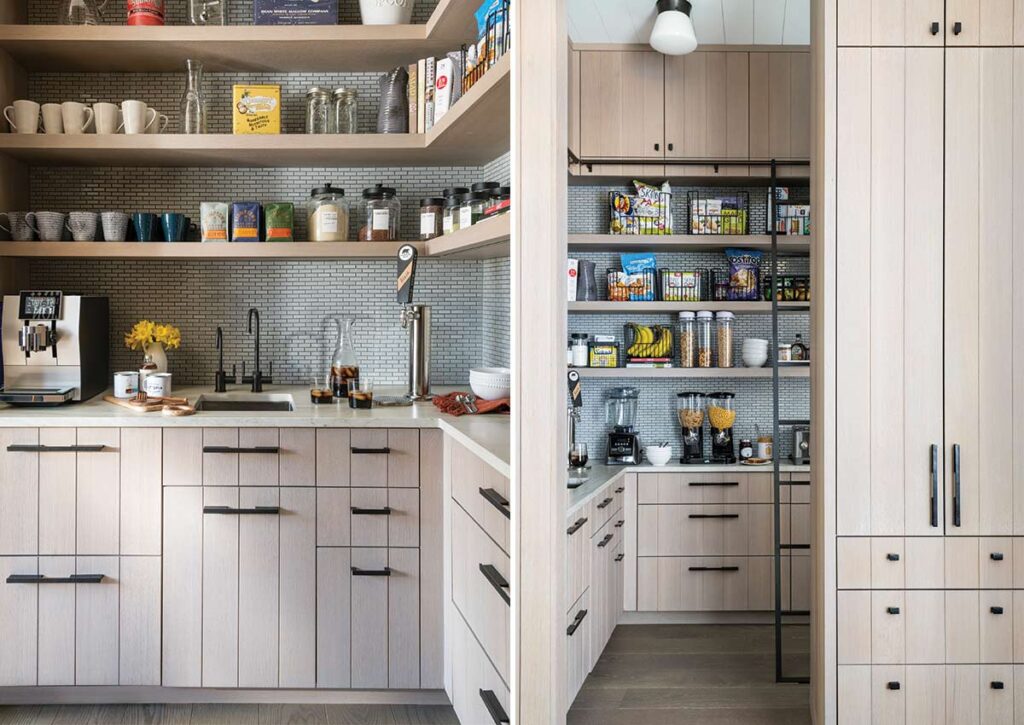
Our Gonna Have a Good Day kitchen has a distinct “California casual” vibe in spite of having its feet firmly planted in the New York suburbs! This was our first and only installation of a remote cold brew coffee spigot, designed after a coffee bar we saw in NYC. Not only does this pantry have plenty of storage for small appliances, but there are also open shelves galore to accommodate pantry essentials. And to reach all the way up, there is a stylish sliding ladder. The entrance to the pantry is tucked around the corner from the main kitchen, but we wrapped it in the same rift-sawn oak for continuity.
Mid-Size Kitchen Pantries
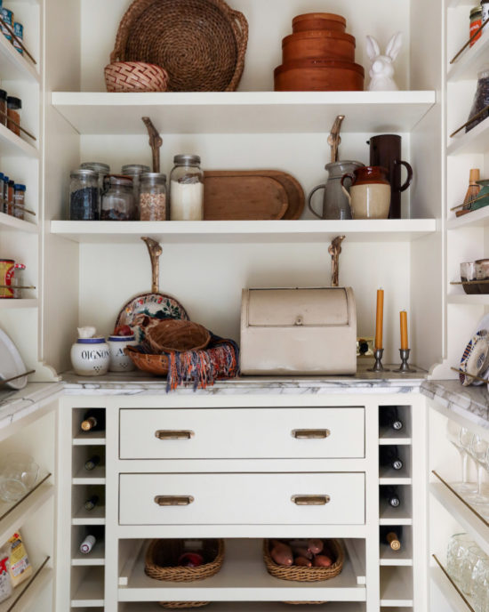
This pantry is part of a kitchen design by Landed Interiors & Homes. It keeps with the style and character of the 1914 Arts and Crafts home it resides in while maximizing storage in a multitude of ways including wine bottle storage, cabinets, drawers, and open shelving. I love the use of baskets for the produce, something we have also been known to do in some of our projects (see Tudor with a Twist), but I also love the mix of hardware and the display of vintage finds – all useful, but also beautiful to just display.
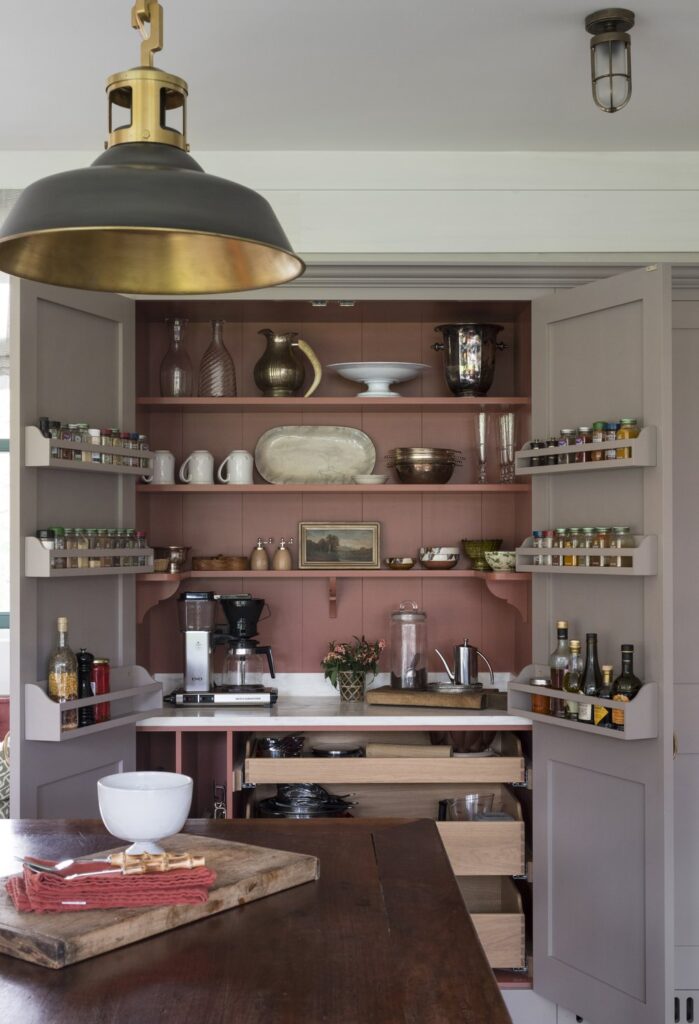
This mid-size pantry by L.B. Copeland Interior Design includes enough space for a countertop but is not a full walk-in pantry. It utilizes pull-out shelves, and rack storage on the inside of the doors, something we add to many of our own designs. I like that there is vertical storage for sheet pans to keep them out of sight and tucked away. And the brick red interior would bring me joy every time I opened this cabinet!
Compact Kitchen Pantries
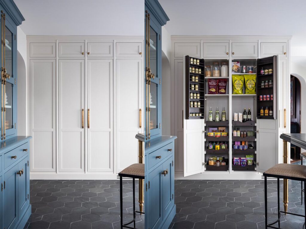
This pantry from our project Tudor with a Twist Kitchen is on the smaller side but makes a big impact. We went with a lot of tall vertical cabinets including this double-door pantry next to the freezer column. I love that even though this is not a separate space, it easily holds everything and is within close reach. Pull-out shelves are one of our favorite tricks for access to those tough-to-reach items all the way in the back and then we added spice racks on the doors to put all those tiny bottles right at eye level.
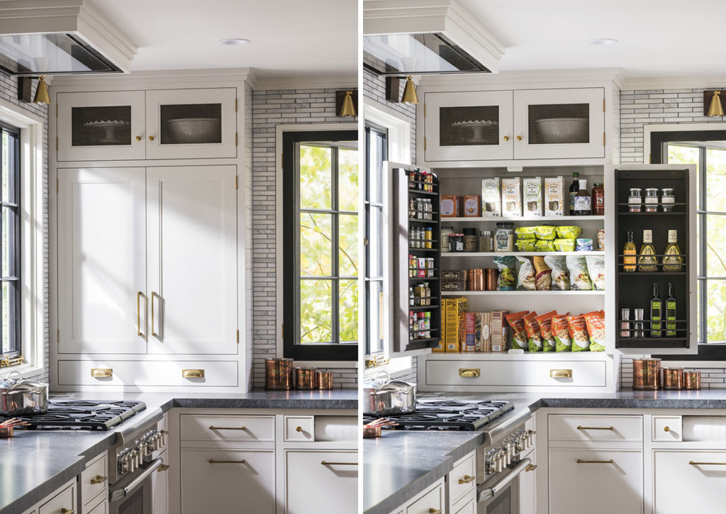
This is my own pantry in my Craftsman home. I don’t have as much square footage as some of my client’s homes, but it works well for our family. Even though this cabinet doesn’t have a lot of depth, I utilized shelves and storage on the doors to have space for all of my spices, oils, and pantry essentials. I love that it blends into the main cabinets and is hidden away while also being within reach.
Kitchen Pantry Design 101:
Designing or redesigning your own pantry? Don’t start until you review these tips. They are sure to help you maximize your storage while also adding some fun and stylish elements.
- Empty out everything and assess what you need to store and what you don’t. This will allow you to determine what space you need, how you can organize it, and what elements you need to source.
- Organize everything you have into categories. This could be by food type, how you use it, or what priorities you have. For instance, we often break out categories such as “breakfast, baking, coffee and tea, snacks, and dinner ingredients” but do what works for you and your own family.
- Assess what you have and how you want it organized. Do you want open shelves and baskets or bins? Do you want cabinets? Will more specialized storage suit your needs more, or do you want flexibility? This is where you can start to have fun, but also get serious about an organizational system that will work for you and your family.
- Sketch out a plan and decide what materials and items you will need to put it in place.
- Purchase what you need, maybe more (you can always return it). This can include bins, baskets, shelves, divided trays, etc. Whatever you think you will need to keep everything contained and organized.
- Put it into place and play. Some things you originally envisioned may work, and some may not, but it’s like putting together a puzzle.
- Add the finishing touches like labels and accessories to complete the look, but also make for easy access at a glance.