Our Favorite Transitional Kitchens
Neither traditional nor contemporary, transitional kitchen designs are a great mix of both styles. We love designing them because it is like solving a puzzle finding and placing all of the right pieces together.
Transitional designs have gained popularity and are great for resale because of their broad appeal. They are also just a lot of fun to design thanks to the wide variety of materials and finishes you can use in a transitional kitchen.
So we decided to round up our favorite transitional kitchens here and share them with you to hopefully inspire your next kitchen design! Some of these are from our own portfolio, but we’ve also added a mix of other designers we love.
Modern Deco Hacienda
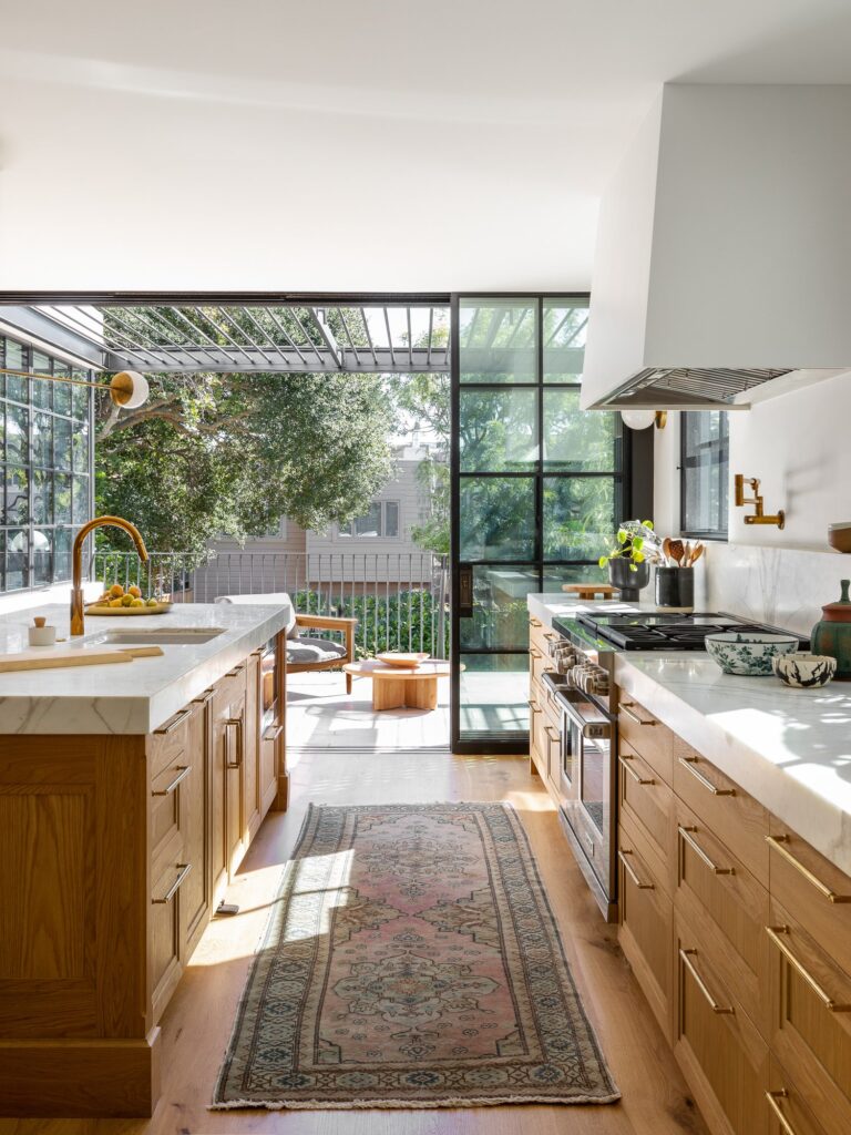
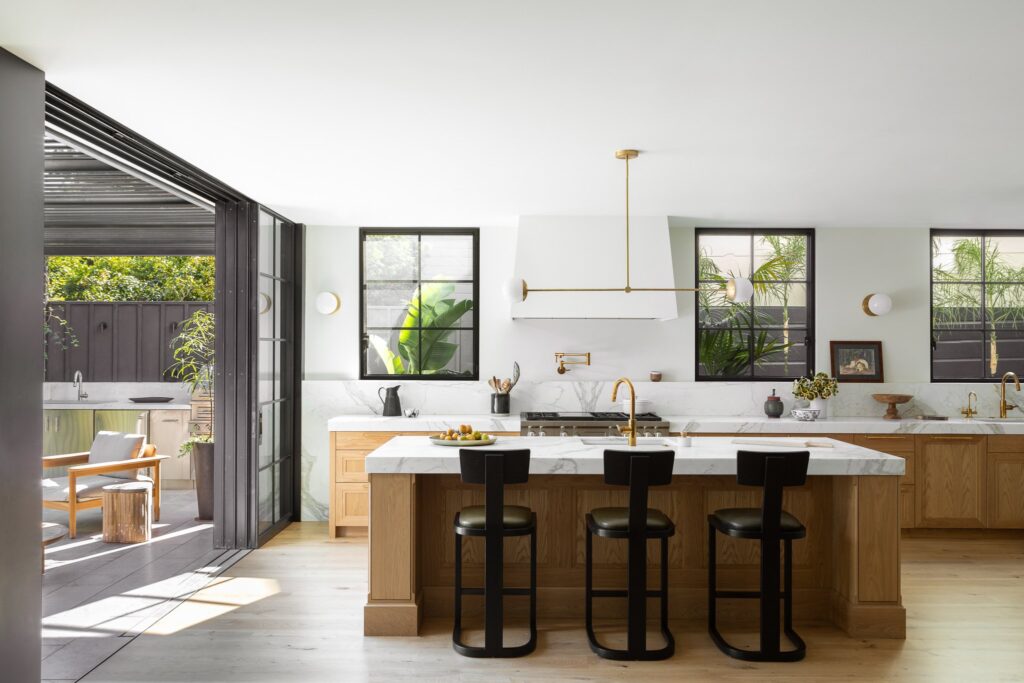
This kitchen was designed by Regan Baker Design in a 1920s Spanish Revival. We love the use of warm wood tones in this kitchen and the inclusion of some traditional and modern elements, but we especially love all of the light offered up by the large sliding doors and windows.
Shades of Gray in Scarsdale
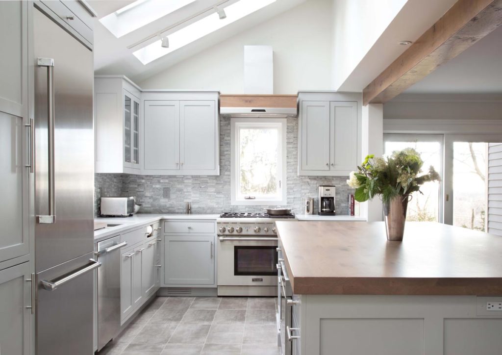
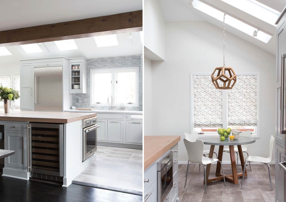
This is one of our own designs that we worked on with Strauss House Designs. I love the mix of materials here and the way the warm wood beams work with the cooler gray cabinets. It is the perfect mix of classic elements and more modern design elements.
Sleepy Hollow Transitional
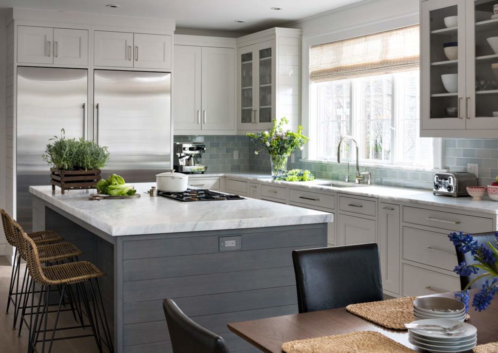
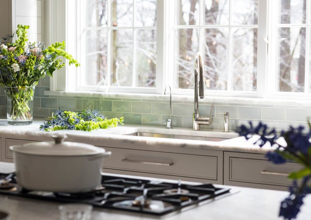
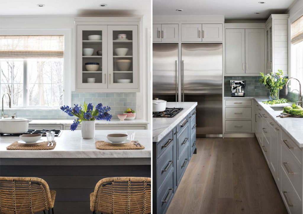
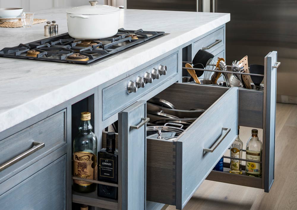
This kitchen remodel was in a young colonial revival home for a growing family. The kitchen area was quite spacious but needed a facelift and a new layout. Painted cabinetry matched to Benjamin Moore’s Light Pewter is balanced by grey glazed rift oak cabinetry on the island. Shiplap paneling on the island lends a contemporary farmhouse vibe. White bronze hardware by Schaub & Co. in a contemporary bar shape offers clean lines with some texture in a warm metallic tone. White Marble countertops in “Alpine Mist” create a harmonious color palette while the pale blue/grey Waterworks backsplash adds a touch of color.
1930’s Classic
This design created by the team at Whittney Parkinson Design was done in a character-filled 1930s classic American home for a modern family of five. They pulled in traditional details from the character of the home while also adding modern amenities and touches. We love how much detail was paid and how warm this entire space feels.
Classic with a New Angle
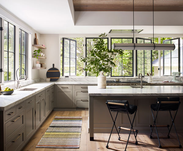
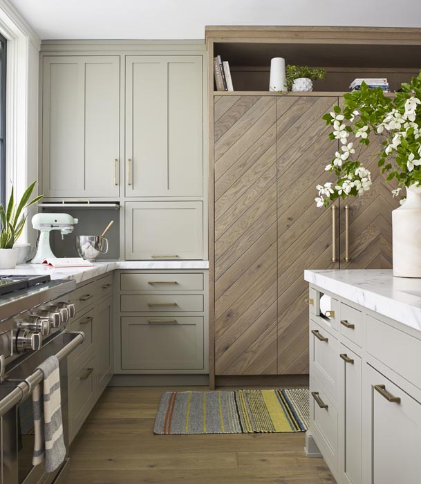
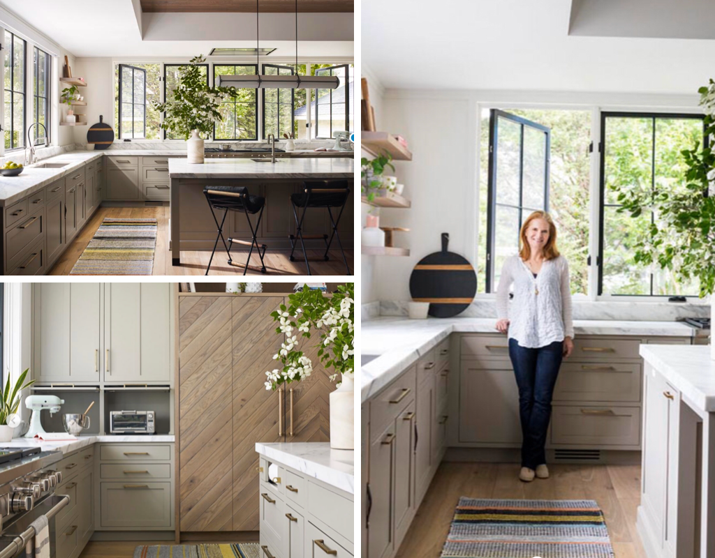
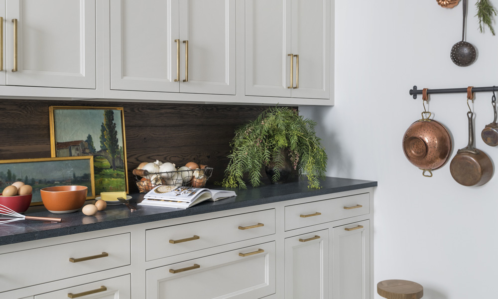
This award-winning modern farmhouse kitchen features rift oak in a chevron pattern, marble countertops, mushroom-colored kitchen cabinets, and aged brass pulls to create a dream transitional design kitchen. The linear island pendant lends a contemporary edginess.
Green Beauty Kitchen
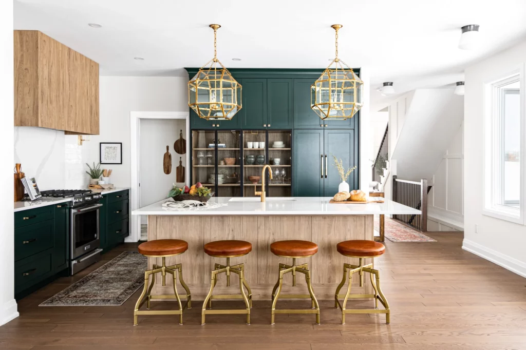
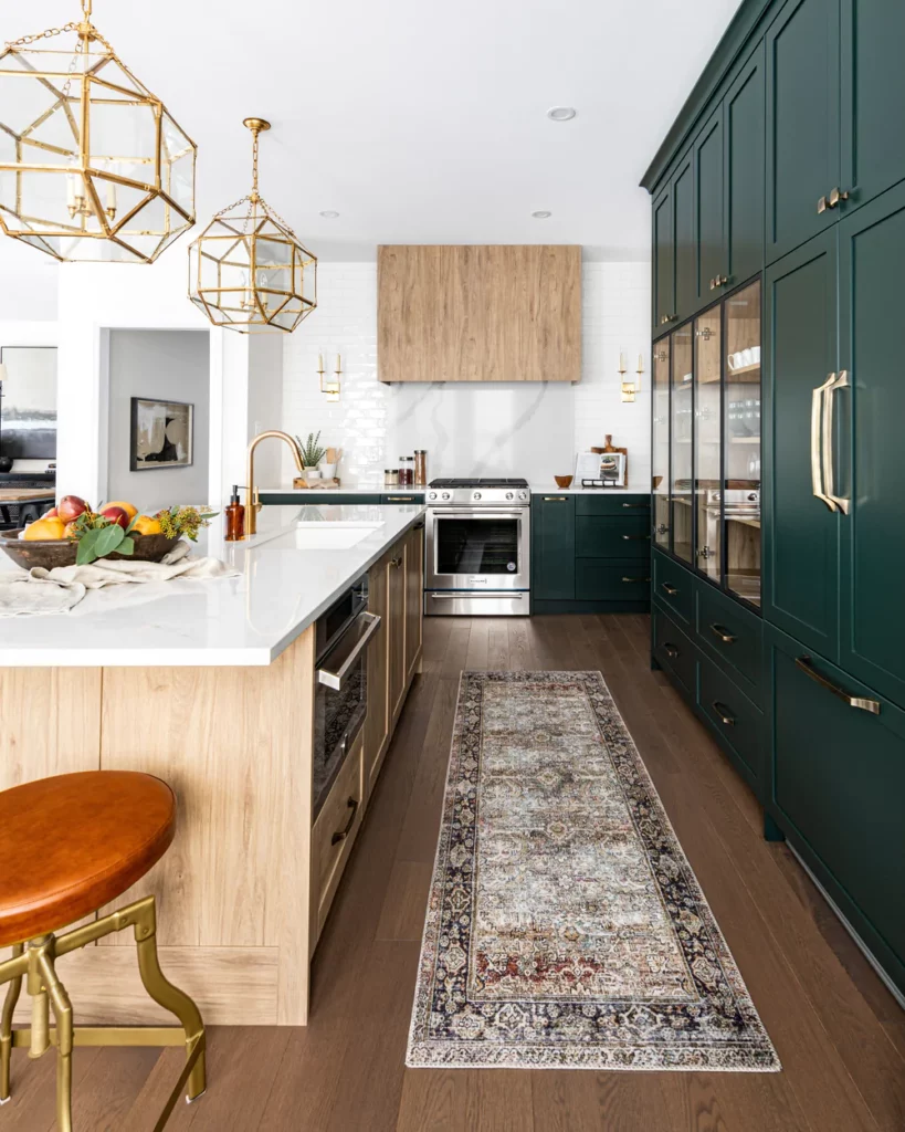
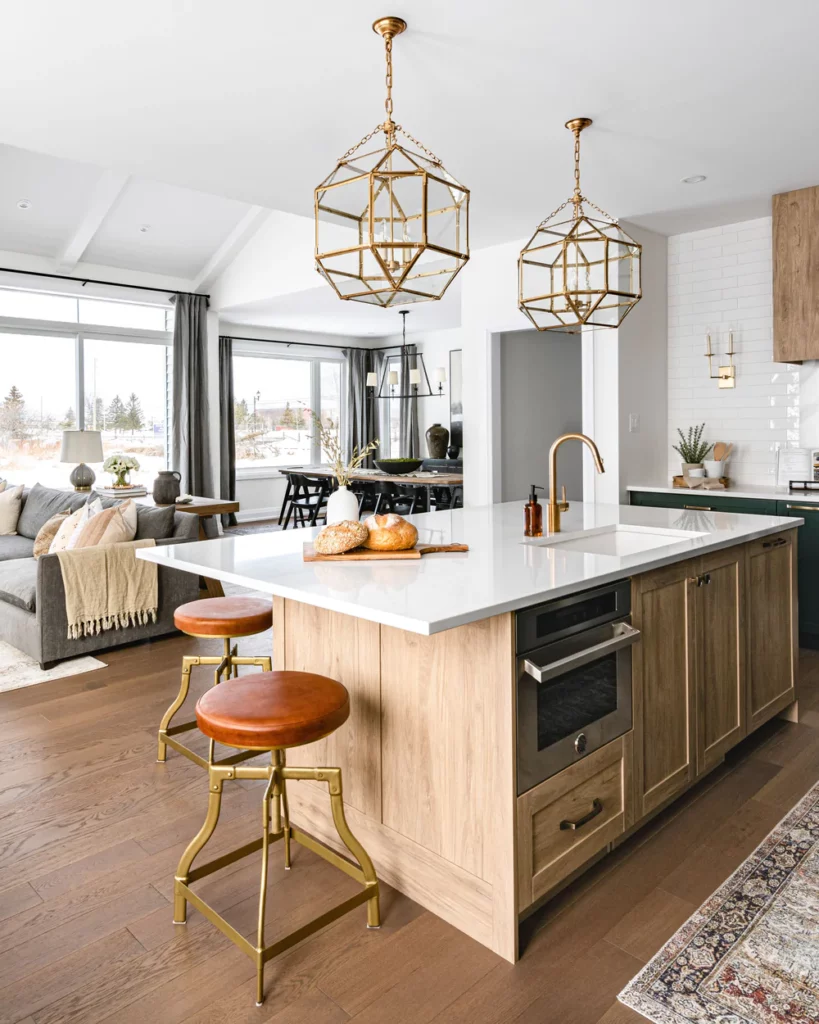
If you know me, you know I love a good pop of color in a kitchen, and that is one of the many reasons I love this transitional kitchen from West of Main Design. I love the mix of finishes and materials (especially the glass cabinets and those orange leather stools!). To me, it is the perfect example of taking classic elements and adding a twist to make it something really special.
Home on a Nashville Hill
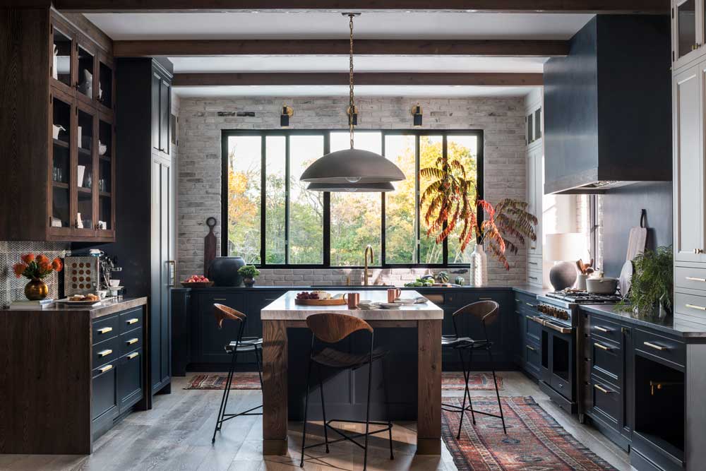
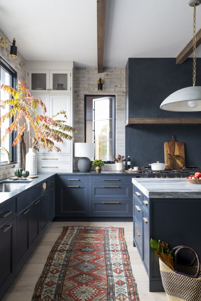
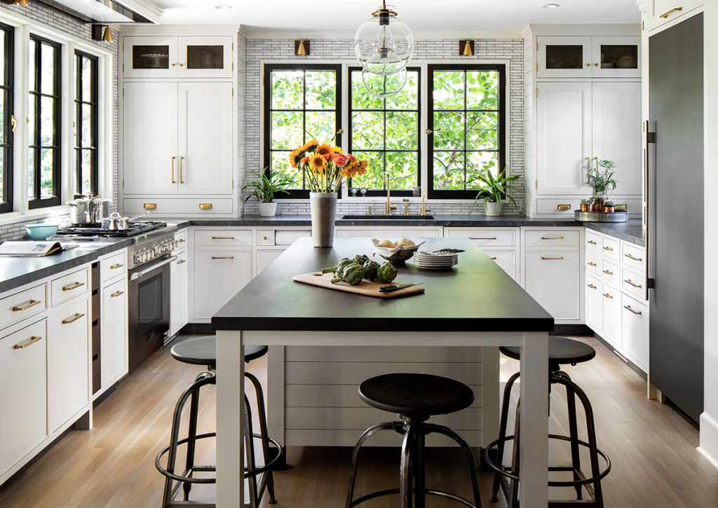
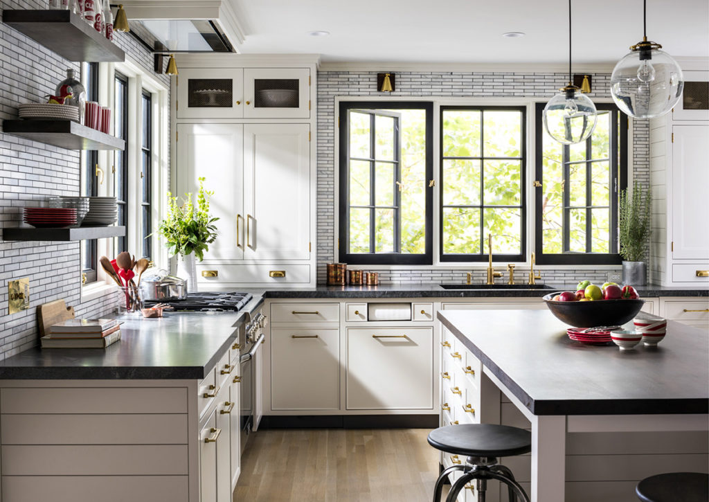
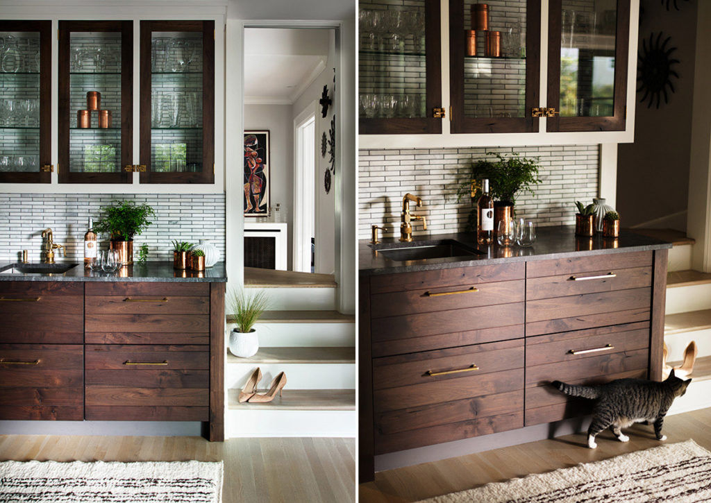
A true collaboration, this new build named Home on a Nashville Hill was a labor of love between the team at Studio Dearborn and homeowner Kelly Ladwig. Kelly has a fabulous eye for materials and knew exactly what functionality was important to her in the kitchen. We brought in some vintage touches including reclaimed brick for the walls, a “burnished brass” faucet, and vintage bar stools and rugs. The end design is a mix of vintage, modern, and dramatic touches with custom storage for this avid cook and her “furry five” family of pets. We are especially fond of the dirty kitchen, which you can read more about here.
Transitional Lakehouse
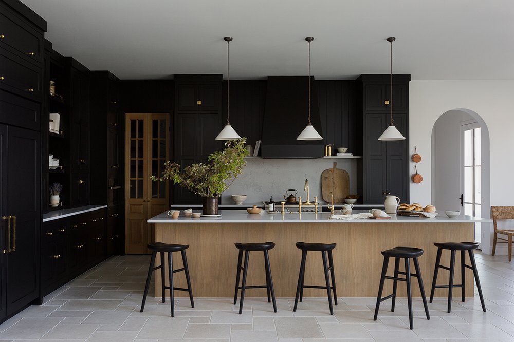
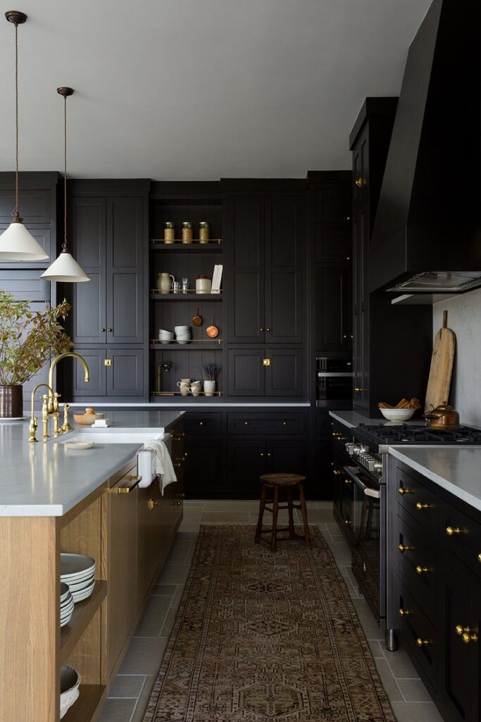
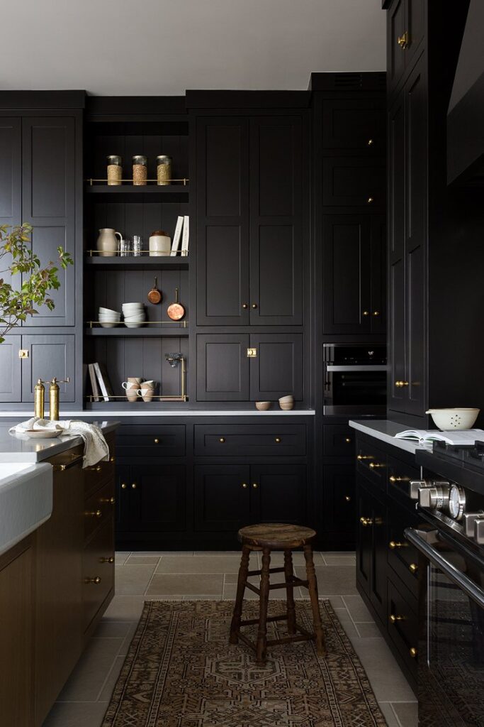
I love the drama in this kitchen by Light and Dwell. The mix of light and dark is beautifully done as is the mix of materials to create a truly transitional kitchen design. Anyone who wants to go with black cabinets is alright in my book!
Airy Tudor Revival
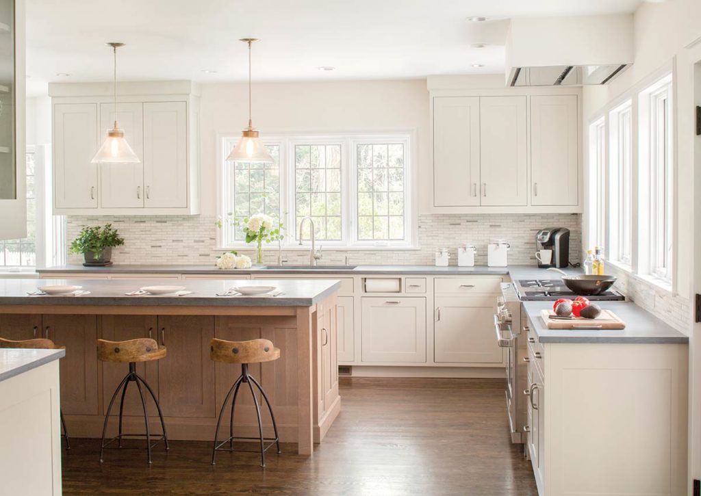
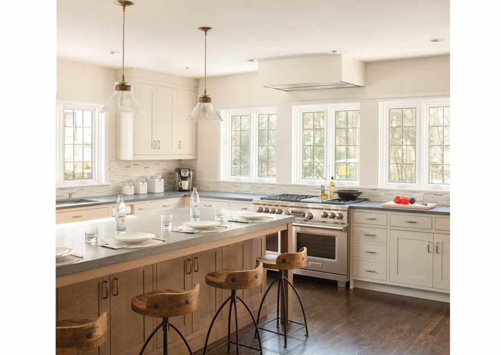
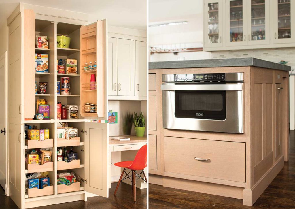
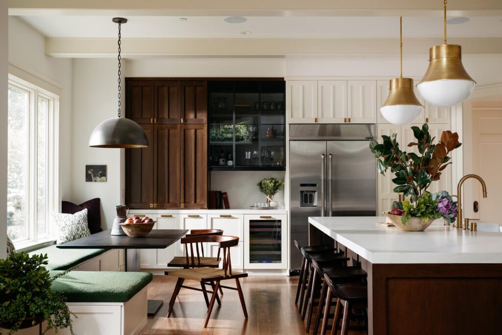
This kitchen was revamped with an open floor plan with a breakfast area and counter seating. We preserved the view of the yard by adding large, leaded glass windows. The entire kitchen is light and airy thanks to the mix of quarter-sawn oak cabinetry and creamy cabinets.
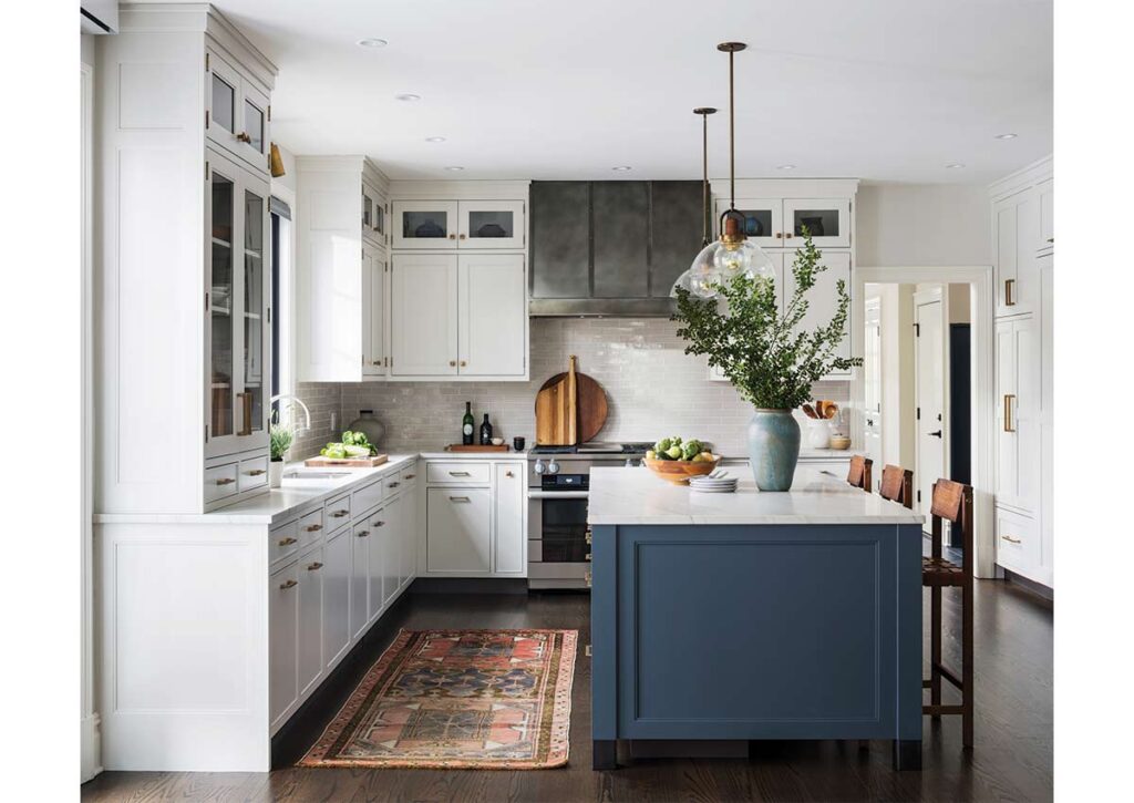
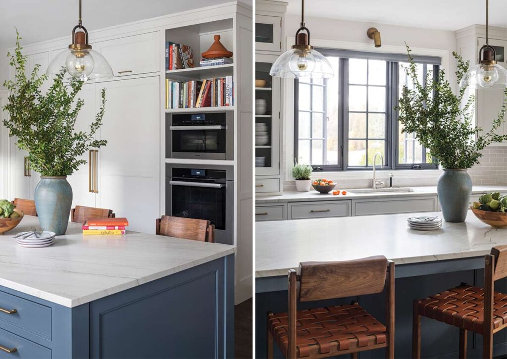
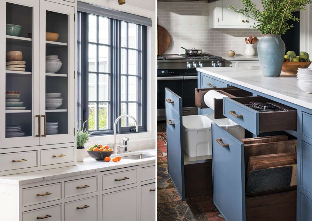
Suburban Sababa
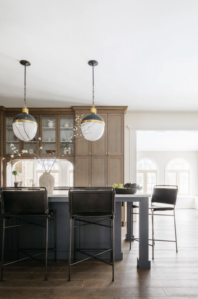
The classic color palette of navy and white comes together with special details including brass hardware and natural elements and a striking hood in this kitchen designed by Studio Dearborn. The millwork and color palette give it a bit of a traditional feel, while modern hardware and shaker-style cabinets, and clean backsplash give it more modernity.
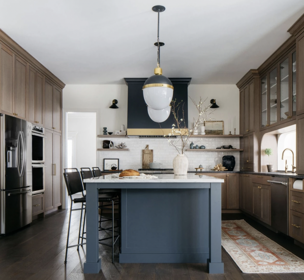
Annarya’s Eaglebrook
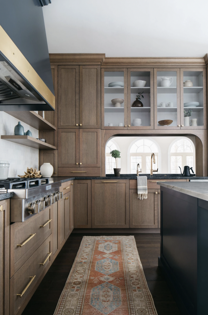
This kitchen design by Annarya is one of my favorites. It mixes elements I love in a beautiful and seamless way and is the epitome of transitional design. I love the black and brass hood, the simple arched brackets, and I especially love how it all comes together.
White and Walnut in Westchester
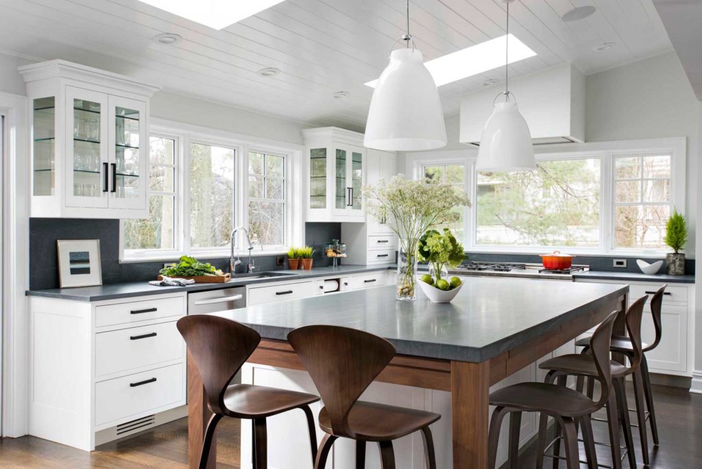
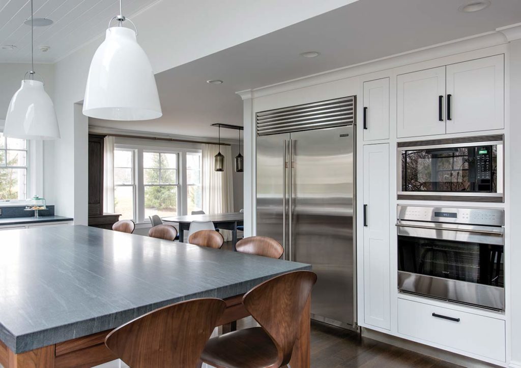
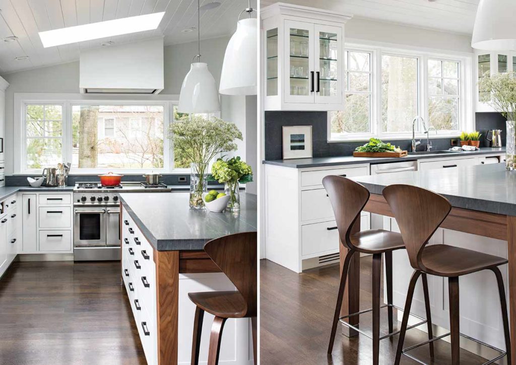
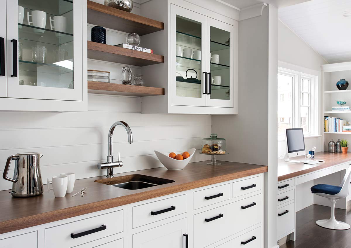
Flooded with light this spacious kitchen in Westchester boasts windows on three sides plus skylights. Ship lap paneling on both walls and ceiling lends a casual-modern charm while stainless steel toe kicks, walnut accents, and Pietra Cardosa limestone bring both cool and warm tones to this clean aesthetic.
A Boundry-Pushing Kitchen
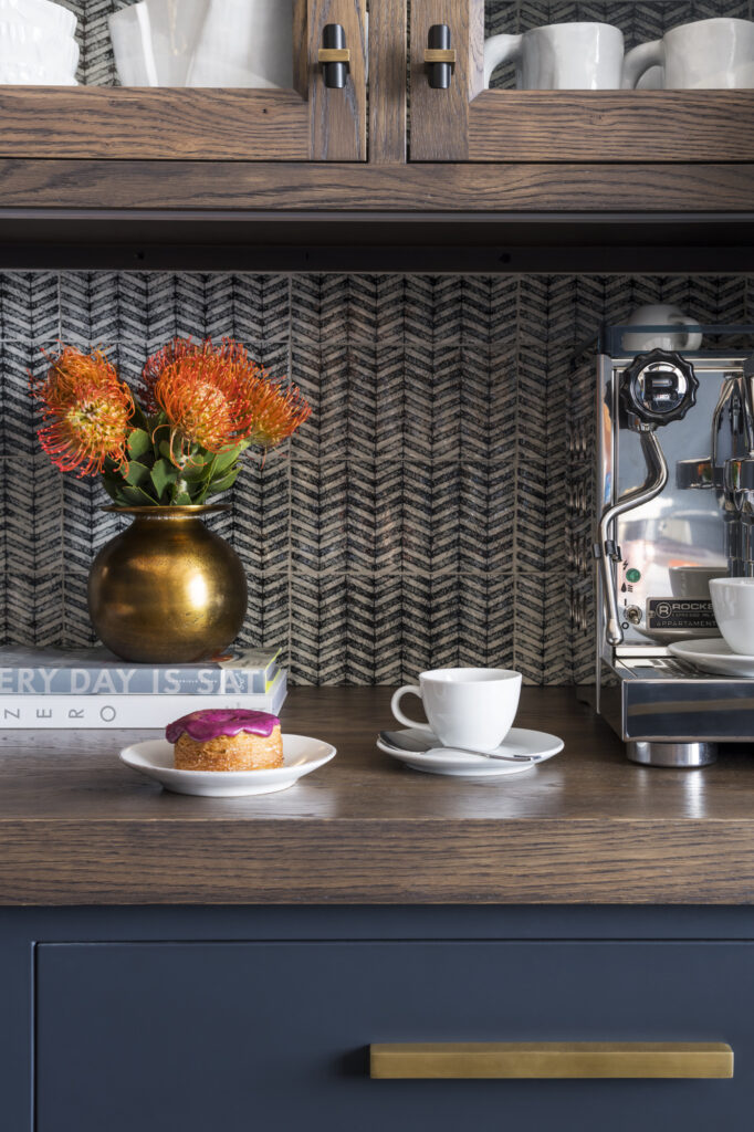
This stately craftsman home located in the foothills of Sierra Madre, CA was built in the early 2000s and was in great condition, but the style was dated. Enter lead designer Patrick Maziarski. The jumping-off point for this transitional kitchen design, rich in design details, was the wallpaper in the family room and the kitchen hardware. The kitchen is the perfect combination of modern conveniences and storied elements that work together seamlessly to create the center of the home where the family can comfortably gather or entertain.
100% Worth the Wait
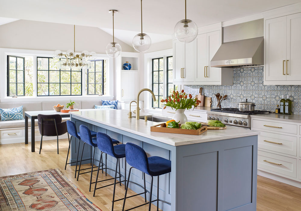
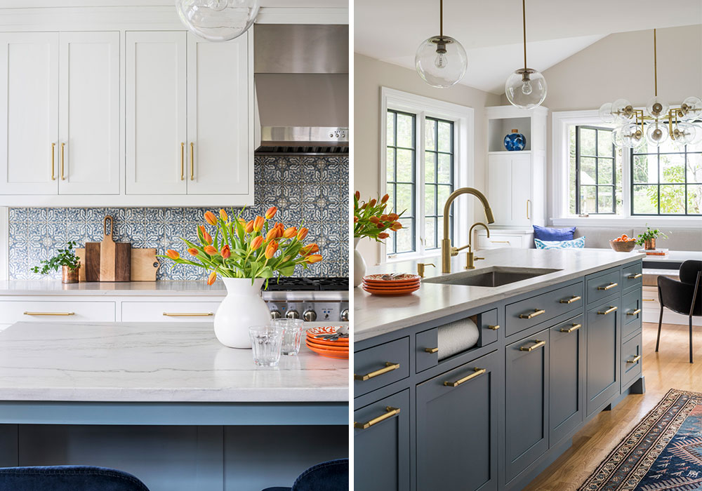
We love any color combination that uses blue (get our favorite blue and white color combo ebook). That’s one of the reasons we love this transitional kitchen. This graceful 1920s Tudor desperately needed a new kitchen after being home to a family of four for nearly 20 years. A back room and bath were merged with the kitchen, and the entire space was flooded with light by the addition of four huge windows. Templeton Gray by Benjamin Moore is the feature island color, and Walker Zanger handmade clay tiles lend the backsplash graceful pattern and color.
Midcountry Blues
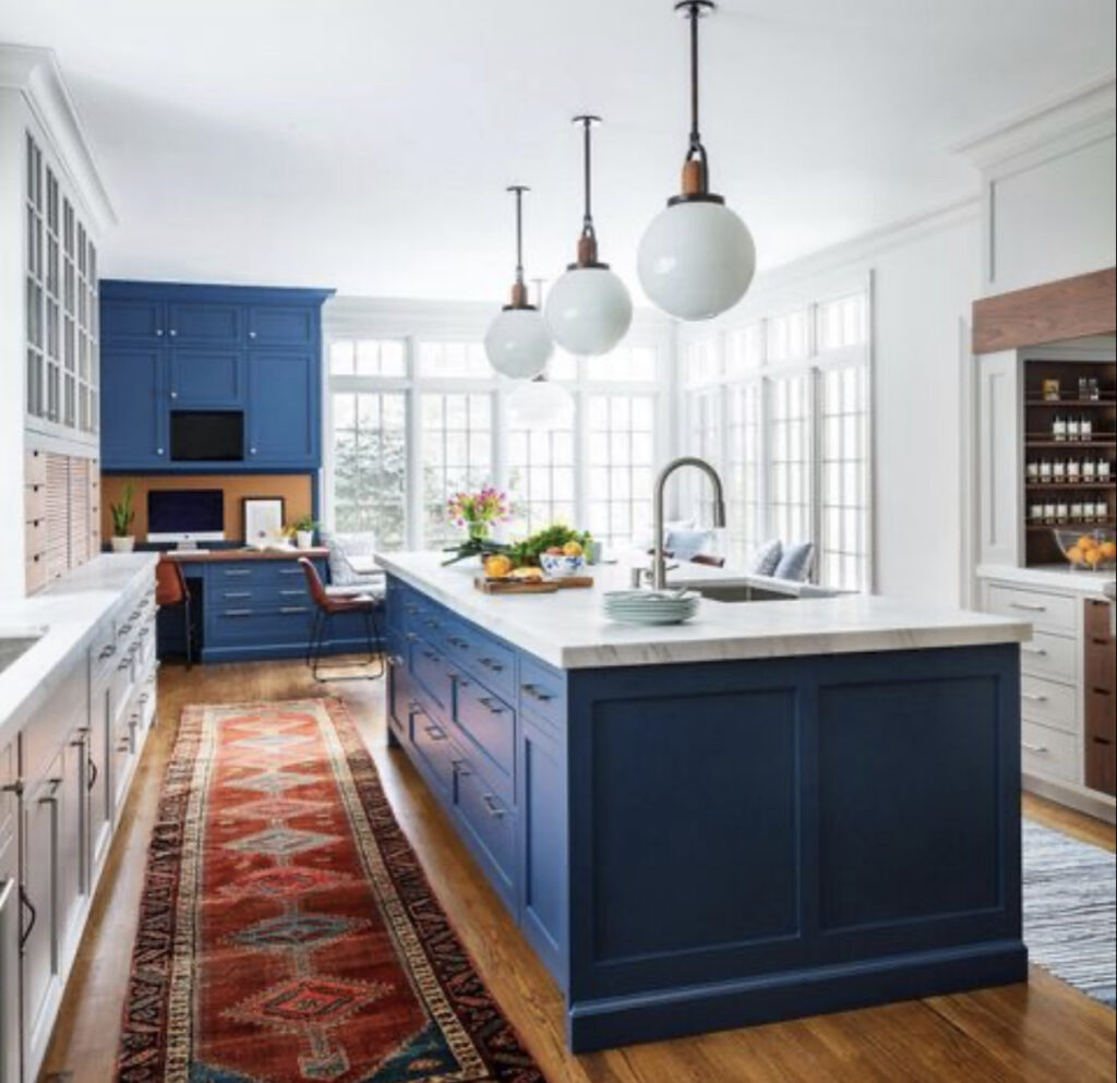
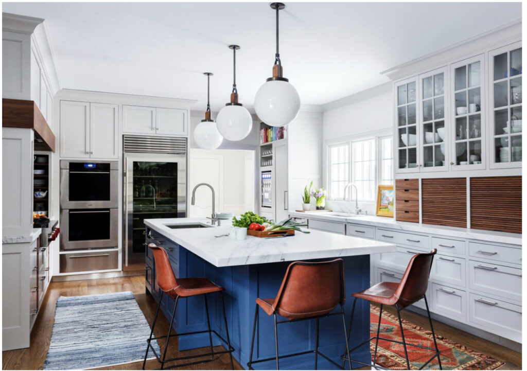
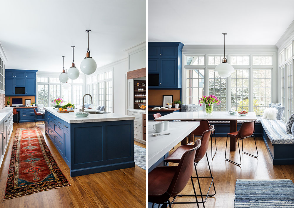
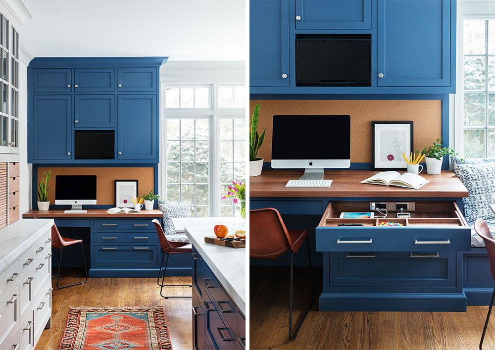
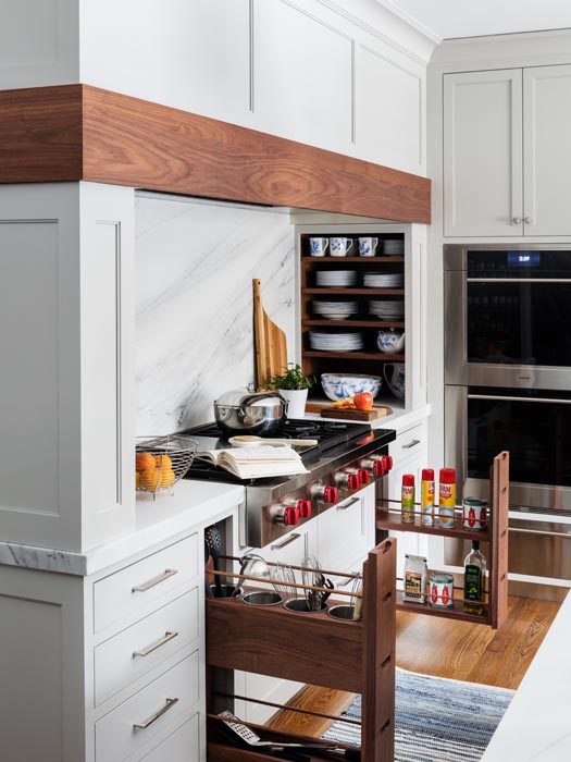
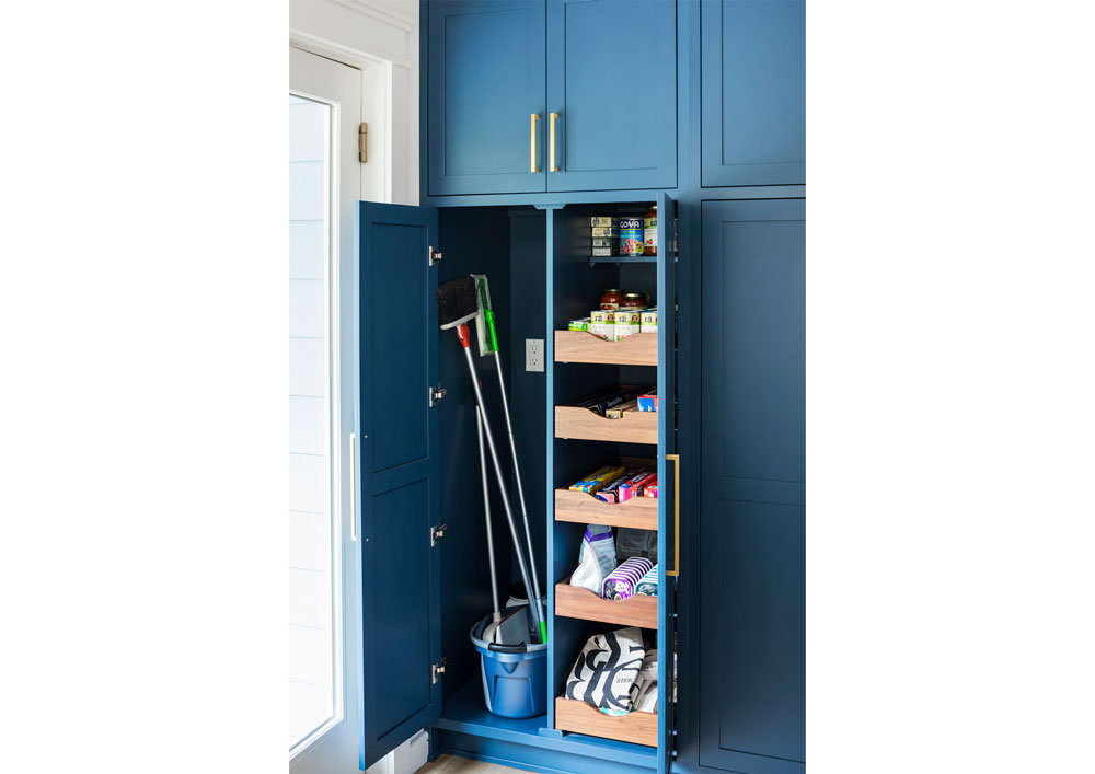
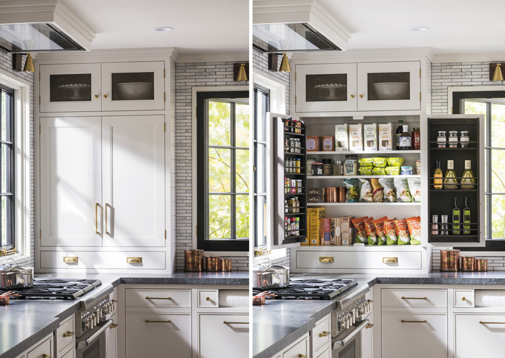
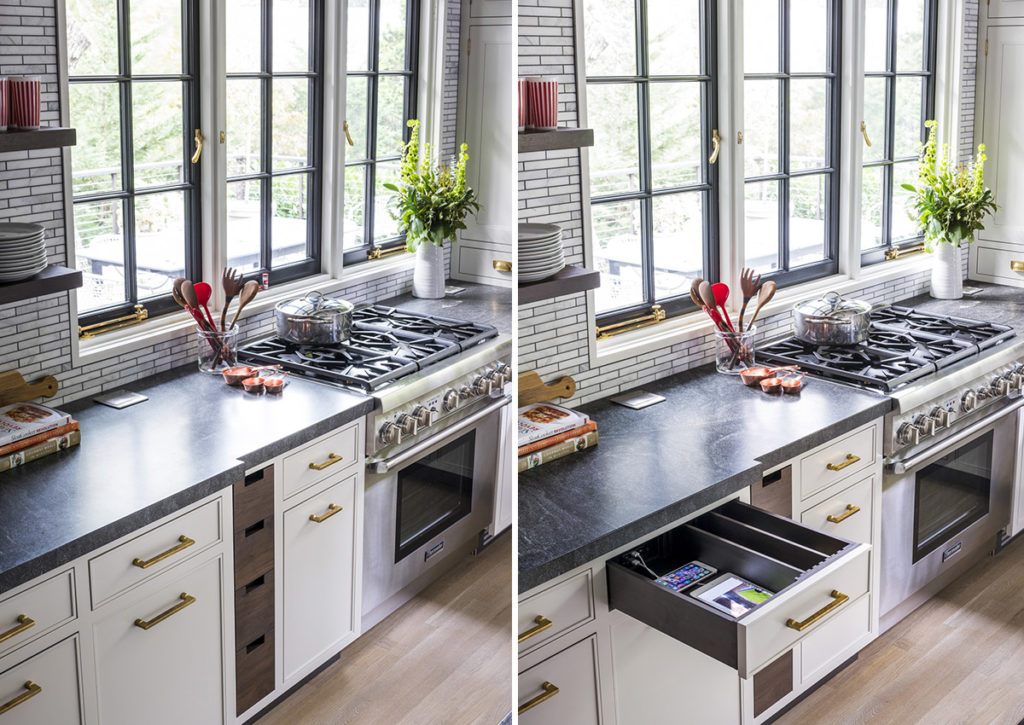
Speaking of blue kitchens we love, here is another one with a deeper hued blue as the showstopper. It is a warm and inviting kitchen designed for a young family looking to reboot their 1990s heavily traditional kitchen. The homeowners cook daily for friends and family and wanted thoughtful storage and an updated, younger vibe. It features plenty of storage including a desk with docking drawer and wood details to give it warmth.
Larchmont Fun House
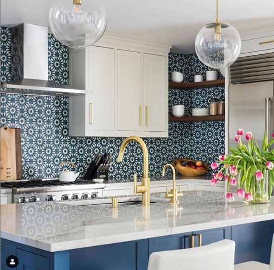
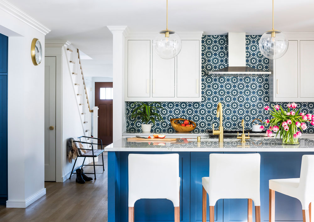
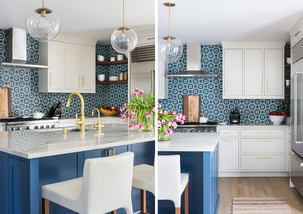
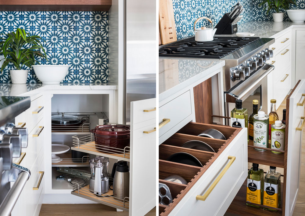
The backsplash tile is the real show of this transitional kitchen. Another blue and white favorite of ours, we teamed up with architect Gregory Lewis. This was a gut renovation complete with a new layout, and the deep indigo plays a starring role on cabinets and the punchy, patterned cement tile backsplash. Sarah wanted this design to feel “fresh, clean, and fun, but not too modern.” Because they went all-in on the bold color and backsplash, the rest of the design was kept more subdued. The end result is a transitional, California-casual look.
Modern Farmhouse Kitchen
This, Sarah’s own kitchen, was gutted in 2017 and the design stands the test of time. The 1920s craftsman home was in much need of a new kitchen. Sarah used black and white as the palette and introduced modern farmhouse details to create the perfect mix of traditional and modern style and functionality. You can learn more about this kitchen here and get storage ideas from this kitchen and others in our Storage Solution Ebook.
