How a Designer Turned a Dated Space into a Dreamy Modern Kitchen with a Sense of History
Marisol and Rhett Thurman always planned to renovate the original kitchen in their circa 1920s Tudor home. A relic of its era, the kitchen was small and dim and didn’t have enough storage or space for seating. The kitchen had just one window and the outdoor light was blocked by a small covered porch that was too small for outdoor dining.
But over the following decades, other things always came first, like cars, vacations, and putting the kids through college.
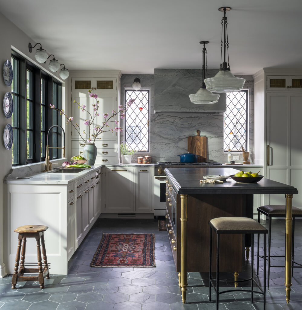
In 2021, after waiting for 20 years, they finally decided it was time to create the modern kitchen they had always dreamed about, and it was worth the wait.
They turned kitchen designer and close friend Sarah Robertson of Studio Dearborn. Their families had met during a toddler playdate years when their sons were just a year old. Marisol was the one who suggested Sarah first try her hand at kitchen design, hiring her to redesign her mother’s kitchen. To round out the team, Sarah recommended Brad DeMotte of DeMotte Architecture, known for his ability to design both functional and architecturally sensitive renovations to historic homes.
“We met over tea, as we often do, and started to talk ideas,” says Marisol. “I had so many special items that had been stored away in closets and often forgotten about, like family china and my collection of teapots and I wanted to feature them and easily grab them whenever I wanted to use them.”
For their home, the Thurmans wanted to open the kitchen up to the outside, bring in more light, and add storage for Marisol’s antique china, kitchenware, and small appliances. They also wanted to expand the kitchen’s usefulness by reworking a tight banquette where the family could enjoy breakfast or a cup of tea. While Marisol loved color and wanted her kitchen to have a wow factor, she didn’t want to do anything that didn’t tie into the rest of the home.
Banquette Seating That Feels Like an Escape
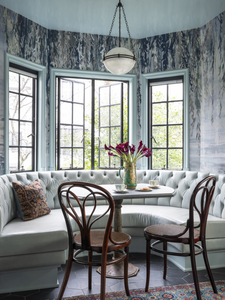
While banquette seating is practical, Sarah elevated the one in Marisol’s kitchen into a dreamy escape. She started by adding a curve, which infuses the seating with a sense of romance, and makes it easier to access. A pair of vintage bentwood Thonet chairs echo the arc of the banquette while adding historic charm.
The showstopper is the weeping willow watercolor wallpaper from Phillip Jeffries that makes you feel like you’re sitting in a treehouse.
“It reminded me of this willow tree that my kids and I used to hide underneath when they were little,” says Marisol.
And the blue in the wallpaper set the tone for the rest of the design. “The blue was really the perfect hue and helped us to decide the color palette for the rest of the space,” says Sarah. “We never considered another wallpaper!”
New Windows + Doors Bathe the Kitchen in Natural Light
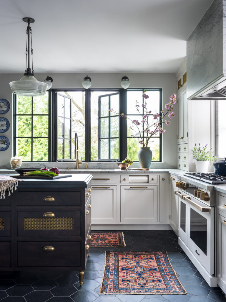
The original kitchen was dark, with just one small window that overlooked the backyard without offering much of a view. And a covered porch on the back of the home further blocked the outdoor light. The team agreed that a large bank of windows over the sink was a worthwhile tradeoff, despite the loss of wall cabinetry. Sarah and Marisol custom-designed a pair of fixed leaded glass windows flanking the range, with diagonal leading and little touches of color that match windows elsewhere in the house. The remaining exterior wall became an enormous sliding glass door leading to the deck, flooding the small bar area with natural light.
“It looks like these windows are original to the house and meant to be here,” adds Marisol.
Clever Placement Solves Two Space Challenges
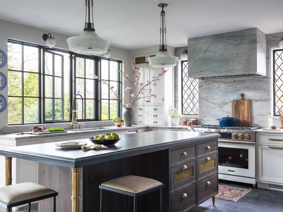
The team originally planned to expand the home but decided it would be too complex and expensive. Instead, they chose to rework the existing space, merging the small kitchen with the adjacent bedroom and bath from the original maid’s quarters into an expansive kitchen and wet bar which felt “right-sized” for the home.
Even after gaining this space, some creative solutions were required to maximize storage and windows. A standard refrigerator would have eliminated a window, so Sarah chose separate refrigerator and freezer units and put them in different kitchen areas to keep the windows intact.
“I really love that the refrigerator and freezer are separate, it’s very functional,” says Marisol. “But everyone’s favorite is the drawer freezer in the bar area where we keep ice cream.”
While the client wanted island seating for her three children, there wasn’t enough room for a row of stools. Instead, Sarah added seating on two sides of the island, in a more conversation-friendly configuration.
“It ended up being plenty of seating for my family and we got a ton of storage,” says Marisol.
A Generous China Cabinet, Pullouts, and Pantry Offer Ample Storage
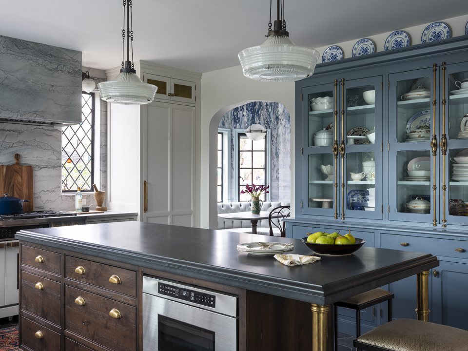
Marisol never knew what to do with the extensive antique Delft china collection inherited from her mother. After finding extra space behind a wall, Sarah chose that for a large china cabinet.
“We looked at cabinets to put here, and then we ran into an issue where we had to hide an AC duct in this wall, so we ended up designing and building this built-in china cabinet,” says Sarah.
The glass front doors let her show off her favorite pieces, while there’s generous hidden storage below. The pullout cabinets beside the range offer plenty of storage for sauces, kitchen utensils, and bakeware, while the food pantry stores paper products, cans, and boxes neatly out of sight.
“I love it because every time I go over to pick out china or a serving dish, it is an experience,” says Marisol. “It also has all of my favorite pieces on display for me to easily use but also for everyone to see.”
Vintage Touches Harken Back to the Home’s Roots

While the kitchen is full of modern conveniences, like a culinary faucet, charging drawer, and programmable Dacor range, it still fits a 100-year-old home. The gray and white quartzite and dark walnut cabinetry ground the space, along with the classic combination of pale greige and muted blue cabinetry. Sarah and Marisol found a local light fabricator to repurpose Marisol’s mid-century Holophane lights as ceiling pendants and paired them with fluted globe sconces over the sink.
Back in the 1920s, it wasn’t possible to source matching hardware for every need. So Sarah curated a mix of different types of brass hardware – oval knobs, bin pulls, long drawer pulls, and the ornate external hardware on the china cabinet – plus turned island legs – to evoke a historic feel. The hexagonal tile was popular in the 1920s, but the dark slate and oversized scale keep it fresh.
The end result is a design that will stand the test of time, one that the family loves and uses every day, and something that Sarah is very proud of, especially since she was able to design this for her dear friends.