Kitchen Design Trends for 2024
We love designing classic, timeless designs for kitchens, but that doesn’t mean that we ignore long-term trends that can become timeless! When we talk trends, we don’t want to make anyone feel like design decisions and purchases from 3 years ago now need to go out to the curb. We think that many of these kitchen design trends for 2024 are going to stand the test of time.
For those of you who already completed your kitchen reno and are ready to refresh, we encourage you to layer in new (hopefully used or vintage) decor, furniture, or housewares that bring more of a mix to your space. With a mix, you are sure to always have a few things that are “trendy!”
Get Ready for Deeper Wood Tones
Rich wood tones are making a comeback in a big way, but this isn’t the ornate detailed cherry wood of the ’90s. These are rich, warm wood tones without a distinct character. As a matter of fact, we like using woods with some knots and imperfections, and we’ve been sticking with a very low sheen to give an aged feel to the wood.
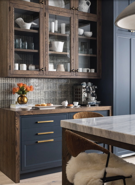
We are seeing darker versions of walnut and even cherry popping up as accents in kitchens, and with the right stain, they can feel both current and very authentic.
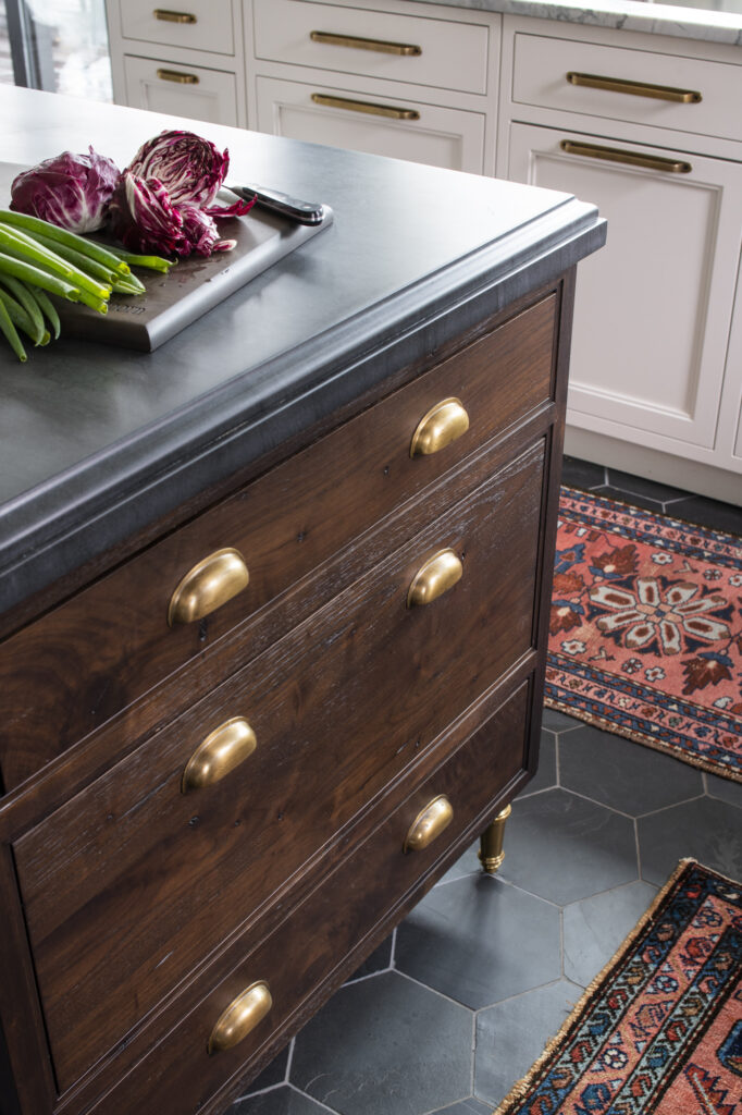
Whether you use it as an accent on the kitchen island, accent cabinetry around the kitchen, or contrasting cabinet doors, we love adding this warmth to any kitchen whether it’s a more traditional design or one with an eclectic feel.
Add a Touch of Vintage Inspired Tile
Tile with a handmade feel has been trending for several years now, thanks to the popularity of zellige tile, a very versatile choice for many styles of homes. But we are now seeing a move towards more “nostalgic” patterned hand-glazed patterns as well, and nothing feels more aligned with this trend than Delft tiles.
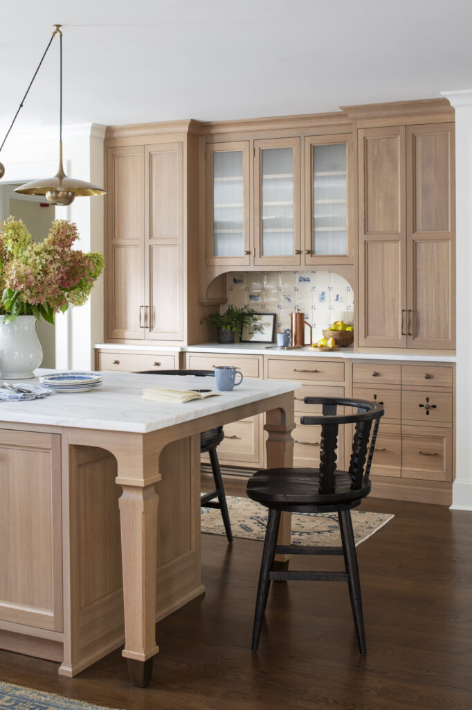
We adapted these beautiful handmade tiles with custom scenes for our client. A little goes a long way on a backsplash in a special area like shown above, or behind the range. We also see patterned handmade tiles making an emergence on kitchen floors again, where wood floors have been so popular now for over a decade.
Bring Back that (Nostalgic) Feeling…
Speaking of nostalgia, design trends right now are all about creating a vibe that reminds us of “the good old days.” We love either infusing historic details into a design or enhancing the details that are already there.
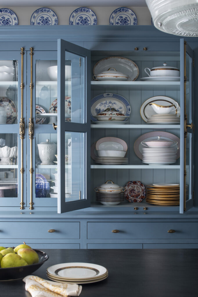
One way to do this is through cabinetry hardware, and we love how it can make new cabinets feel a bit like old antique furniture. On the blue cabinet, we used cremone bolts to add some drama and old-world charm.
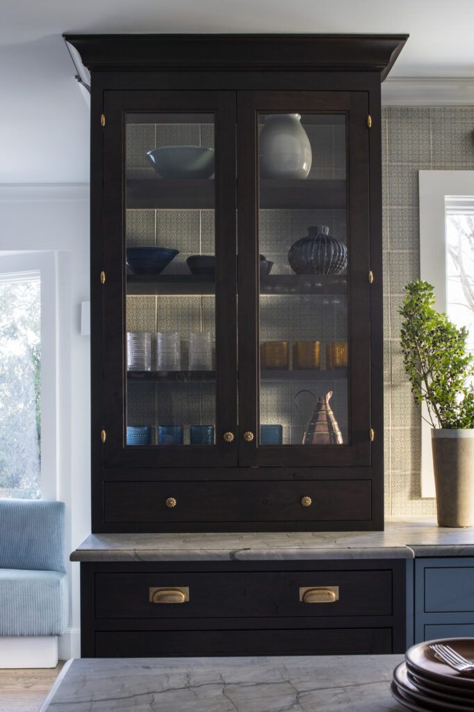
On this cabinet, we used brass knuckle hinges (also known as “olive” hinges) with decorative brass knobs to differentiate it from the rest of the cabinetry and added cup pulls on the drawers below.
If you want to get this look without replacing all your cabinetry hardware, consider replacing just a few knobs or pulls on a special section of cabinetry. I often shop for vintage hardware on Etsy, and you might find a few pieces there too!
Embrace Your Inner “Girlycore”
Ruffles, pleats, bows, and flounces are everywhere these days. Starting on the runways and street fashion several years ago as “cottagecore” this trend has evolved into an even more feminine form and is now influencing interiors in a big way. You’ve probably seen the term “coquette” pop up in social media – well this is the latest form with a bit more of a British, sophisticated (think Bridgerton) form. We see this trend in lighting styles, sink skirts, window treatments, upholstery, and other details in kitchen design.
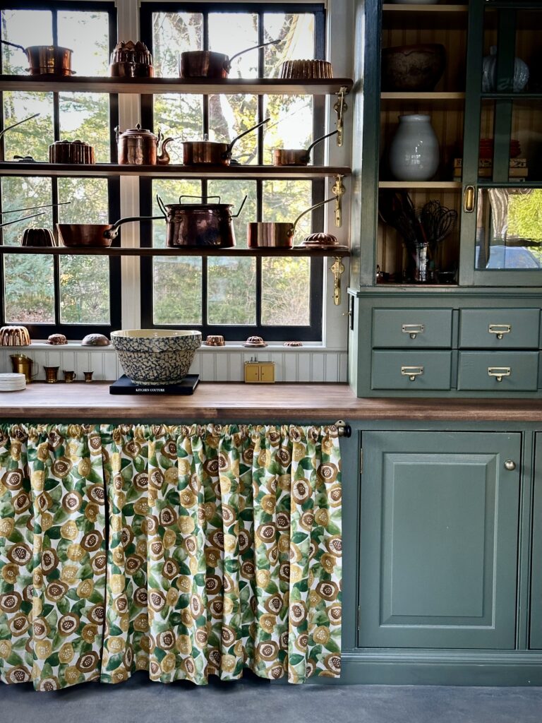
In the Studio Dearborn studio space, we used a floral skirt to hide a large storage area under the countertop. It was an inexpensive solution, adds personality, and gives us versatile storage under the counter!
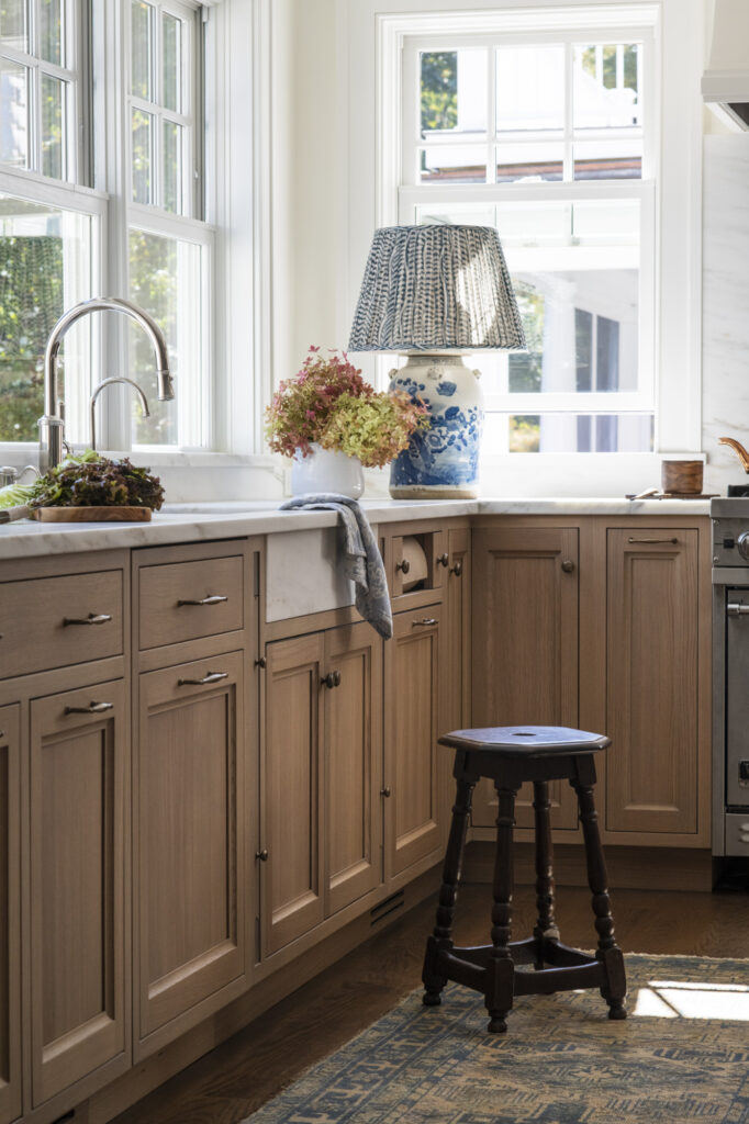
An easy way to pull this trend into your kitchen (with minimum investment!) is with a table lamp, as we did here in our Project Bygone Days. The lamp (from Oka Home) has a beautiful ceramic base that ties into our Delft tiles, and a soft pleated shade. A vintage lamp (from Etsy, eBay, or a local estate sale) would work really well too!
Go for the Silver
Although gold and brass finishes have dominated design in recent years, that does not mean silver metals have gone away. In fact, many designers are using them more than ever on their own, or mixing metals.
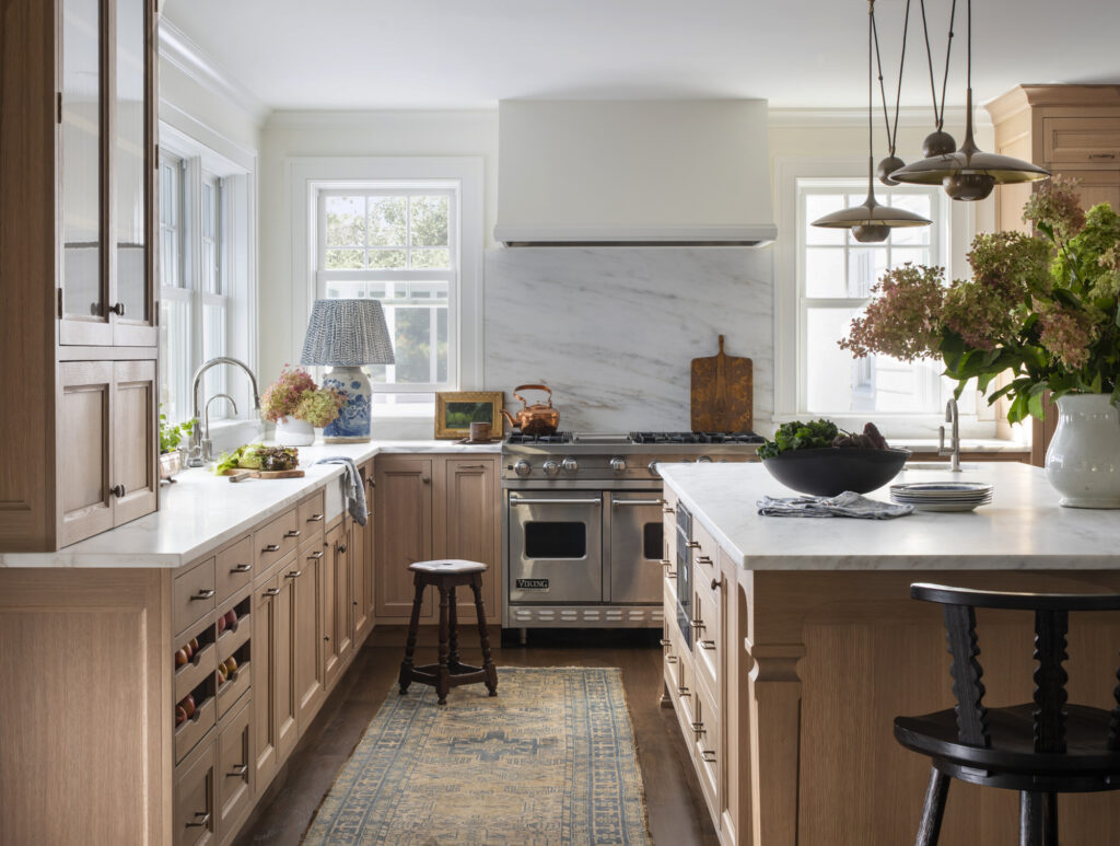
We love mixing chrome and nickel with warmer metals like we did here in our Project Bygone Days.
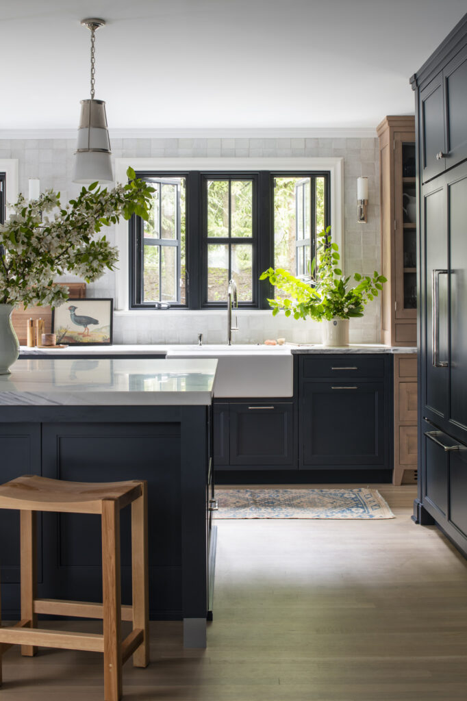
In our Project In the Midnight Hour, we used polished nickel everything, because it was our client’s favorite finish. We warmed things up with a warm birch display cabinet and oak floors. Here at Studio Dearborn, we believe that quality classic finishes such as polished nickel will never be “out of style.”
If you feel like you overdid it on the brass in your new kitchen, don’t despair! By adding decorative accents of silverplate, pewter, or polished nickel, you can bring a mixed metals feel into your space and have some fun shopping in second-hand stores!
Put Your “Stuff” On Display
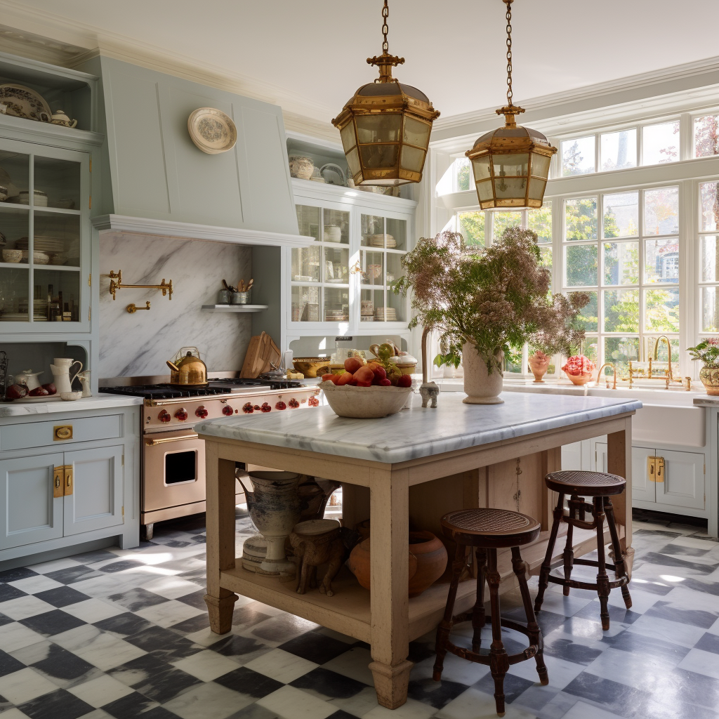
Collections are on display now for everyone to see and we are here for it. Dishes, glassware, teapots, china, you name it, if it’s pretty, we want to see it. We even encourage clients to use glass cabinets to display pretty mixing and serving bowls, copper cookware, and other more utilitarian things, as long as they are curated.
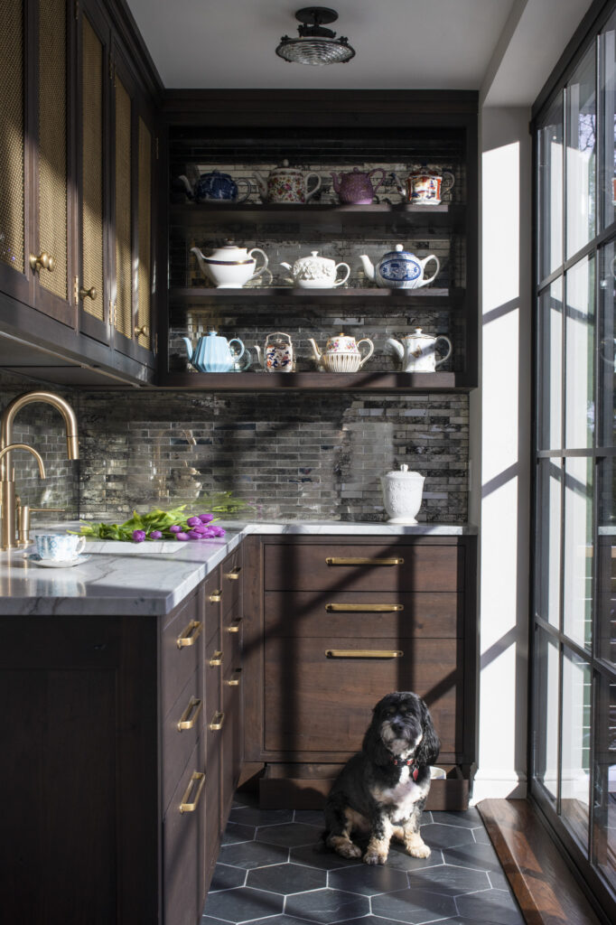
In our Project Tudor with a Twist, we designed custom shelves to display our client’s antique teapot collection, and she loves being able to reach them all so easily!
Whether you display them on open shelves or you have a china cabinet with glass doors, we are seeing a huge mix of ways to display collections.
Drench It with Color
We all know that color can be transformative, and “color drenching” takes it next level! Monochrome dressing is all the rage right now (and has always been a favorite look of mine!) and it’s finding its way to interiors too.
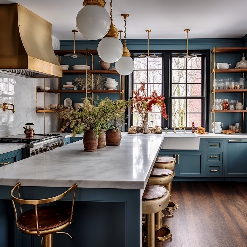
In this AI design, we chose a saturated blue for the cabinets and back wall to wrap the kitchen in color. In the pantry below, we literally “painted” everything in the same Wedgewood blue tone. Using a bold or muted tone creates a beautiful monochromatic design that is at once beautiful and relaxing.
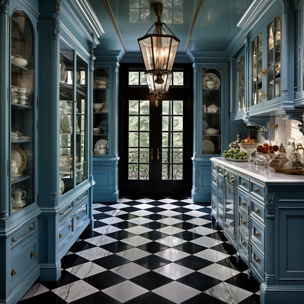
In the pantry above, we literally “painted” everything in the same Wedgewood blue tone. Using a bold or muted tone creates a beautiful monochromatic design that is at once beautiful and relaxing.
Pass the Trim, Please!!
Ceiling beams, coffered ceilings, and crown mouldings are all back! A lot of these trends were ornate details we saw years ago that went away but are now making a big comeback. The bigger the better in some cases, including larger crown mouldings that wrap to the ceiling, more substantial casings, and baseboard moldings.
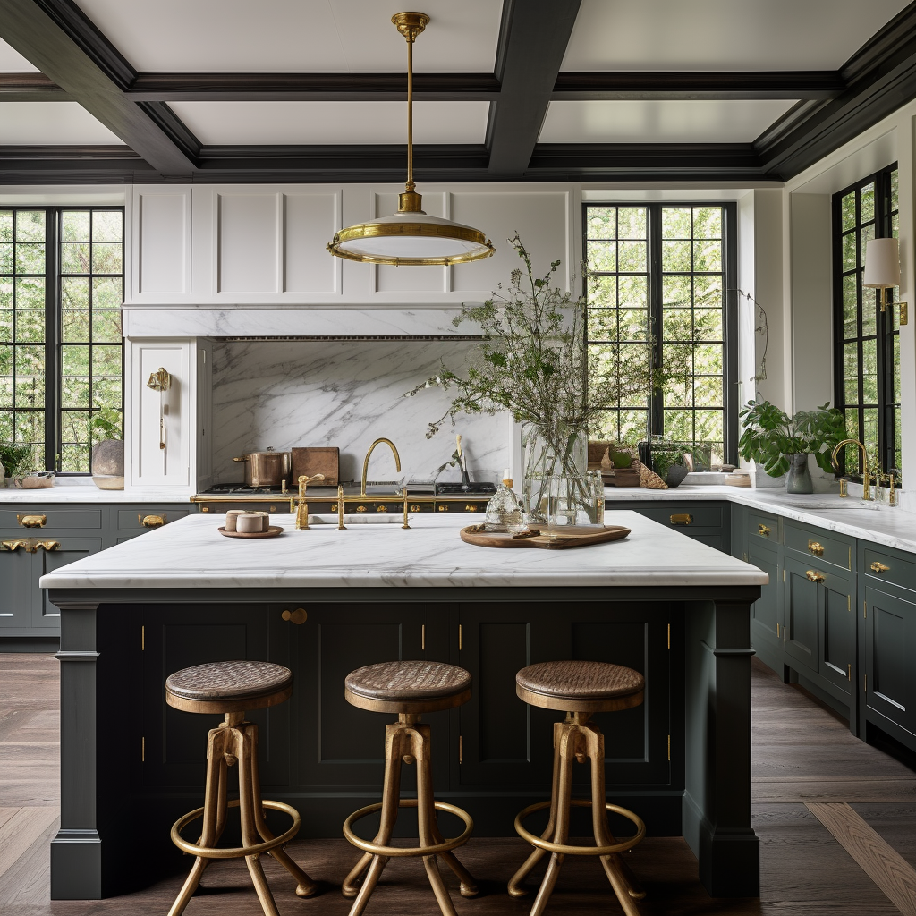
We are also seeing bracket feet making a comeback on our cabinetry. Keep an eye out for that in 2024!
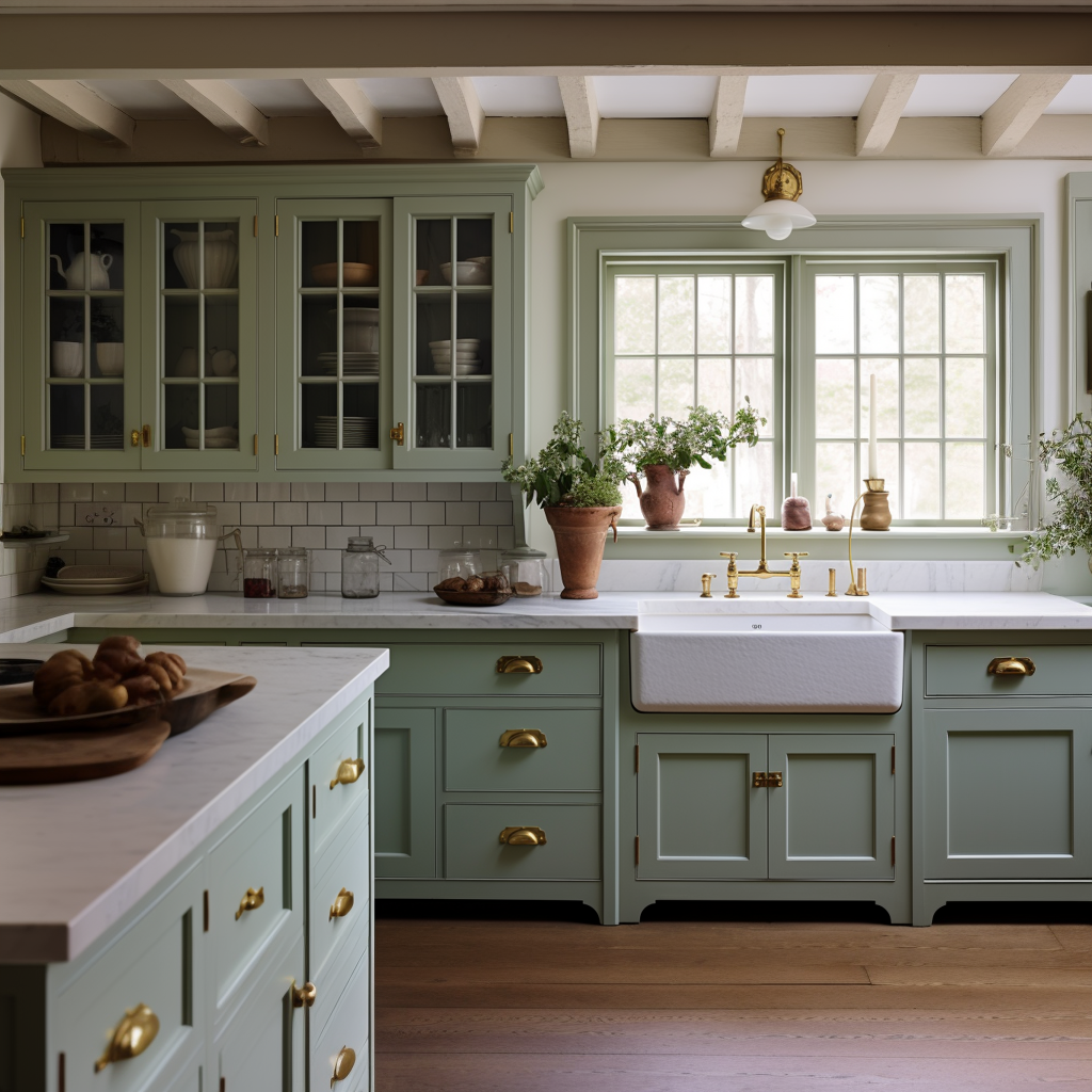
We have used a lot of these “trends” already in our designs, but be on the lookout for more in the coming year. Did your favorite trends make the list?