A Kitchen Tour of “In the Midnight Hour”
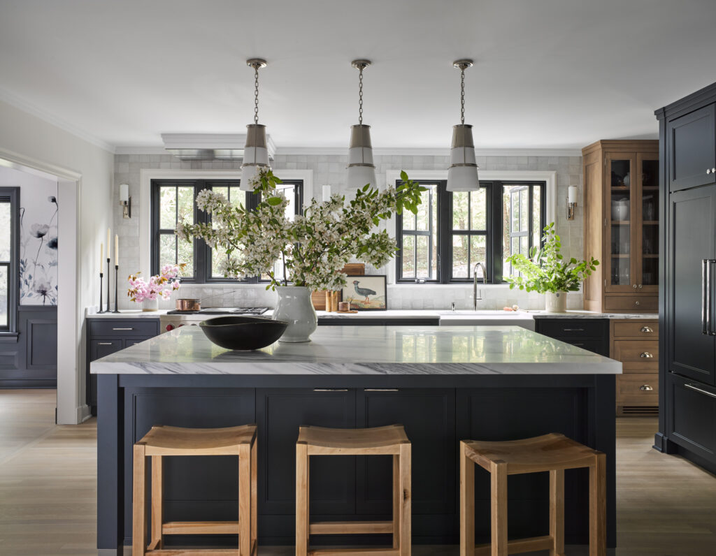
What was once a cramped and dark kitchen with a decades old brick pizza oven is now a family-friendly, open, and airy kitchen thanks to our fabulous team. We teamed up with architect Jaclyn Tylor of Tyler Architecture to help a busy young family to create a larger and more functional kitchen for family and entertaining.
Getting Started
Our client had a more polished aesthetic in mind for this cozy Cotswald style Colonial. Our trasitionally styled kitchen needed to be a marriage between those two potentially disparate styles. Our client was excited to try an on-trend very dark navy for her cabinetry, but wanted to add warmth with some wood cabinetry accents. One of our bigger challenges was figuring out the balance of these two finishes. She was also commited to using polished nickel metal finishes, which is a finish we have been using less these days, (or mixing with other metals) so we found this choice to be a challenge as well.
To get started with this design, the team opened up the space creating a larger footprint. This included taking down a load-bearing wall and opening up the kitchen to what was a maid’s quarters.
Thanks to the newly opened floor plan and the addition of large windows that look out onto the backyard, the new kitchen is flooded with natural light, a must for my kitchen designs. I tend to not focus on a lot of wall cabinetry, leaving room for larger windows, and make up for the lost storage space with well designed base cabinetry.
Kitchen Zones and Storage Solutions
As with every kitchen I design, we focused on the most used zones in the kitchen, making sure there wasn’t too much overlap:
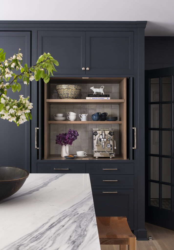
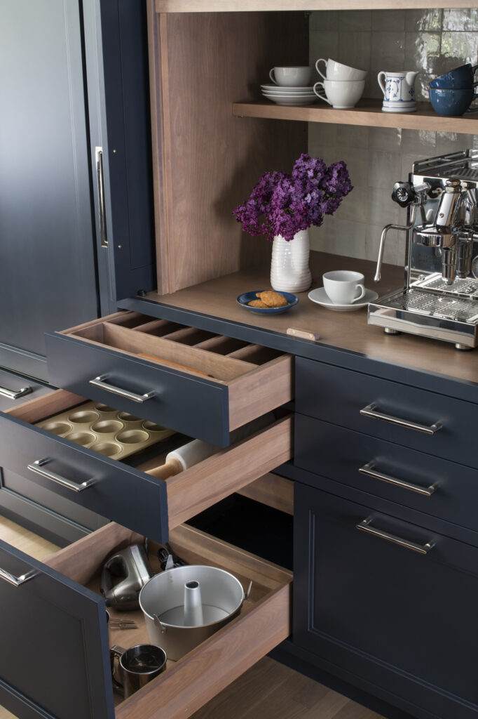
- Coffee Station – This hides away the coffee maker and everything else to make a cup of joe in the morning. There is also ample storage here for tea, coffee supplies, baking supplies, and water bottles. Located adjacent to the refrigerator, it puts the coffee area a couple steps outside of the main cooking zone.
- Prep Zone – The huge kitchen island serves as an amazing prep area for this hard-working kitchen. It has a ton of prep space thanks to the large surface area, but also plenty of storage for cooking, prep, and serving tools within the cabinets.
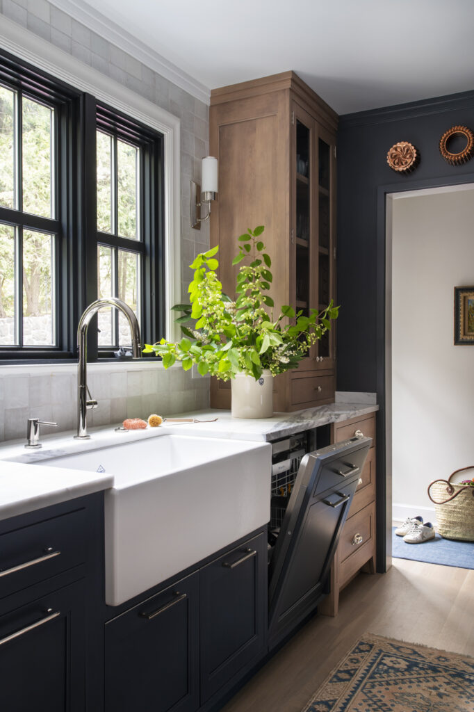
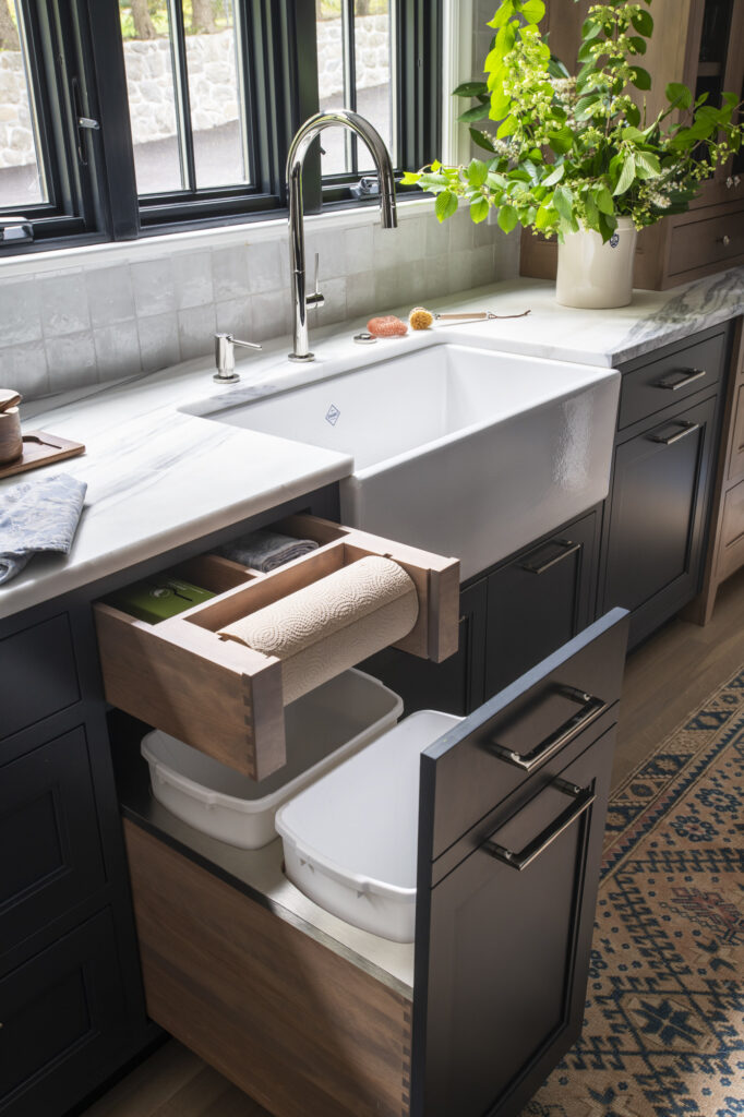
- Cleanup Zone – This includes a deep farm sink, dishwasher, and pull-out drawers for cleaning supplies below.
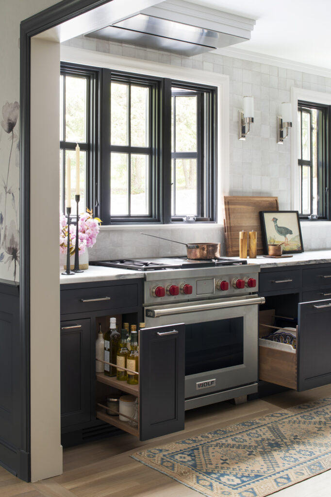
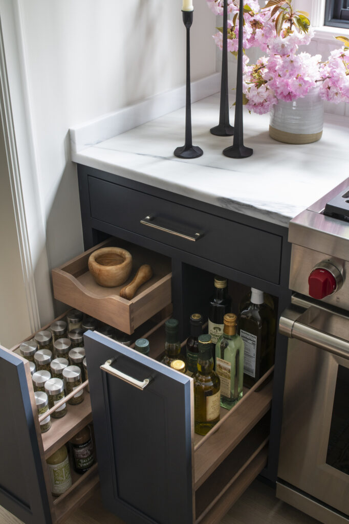
- Cooking Station – The range with recessed ventilation (see more below on this), is flanked by pull-out cabinets that house spices and oils for easy access.
- Dishware Zone – A small built-in china cabinet accomodates all of the family’s everyday dishware and glassware. We designed it in a contrasting light birch wood to give it a furniture feel.
Family-Friendly Design
Raising a family has brought me some great new insights as to what does and doesn’t work in the realm of the kitchen. Most of my clients have young children, so I bring that knowledge of how a family’s needs evolve into the planning process. For example, we encouraged the client to consider mudroom storage a priority, adding extra, flexible storage for backpacks, shoes, and everything little ones need when getting ready for the day. These cabinets will easily transition to a new role when mudroom storage is less of an issue.
Special Kitchen Details
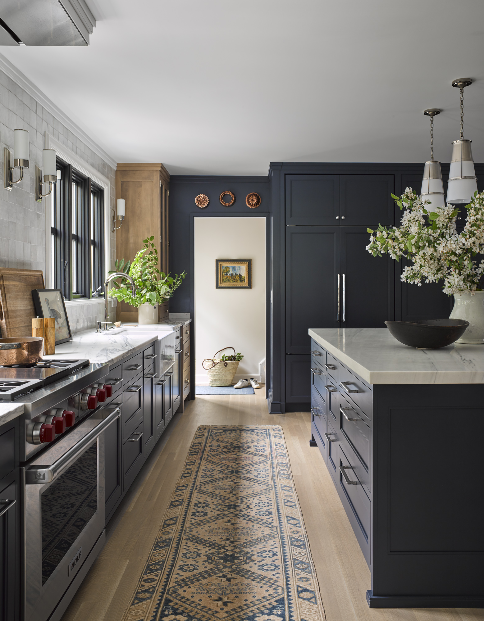
The natural light and openness of the new design afforded us the opportunity to be more dramatic in our cabinetry paint color, and we chose an off-black with a tint of blue for the cabinets. We felt it was a gorgeous contrast with the pale oak floors, but we wanted a hit or two of wood, so we brought in a pale birch for the china cabinet. We chose birch instead of white oak because it is a plentiful material that is more environmentally friendly than white oak, and much less expensive. With careful attention to the right stain, it is difficult to differentiate from white oak!
We touched upon the cooking ventilation earlier, which is another unique (but very functional!) aspect of this kitchen. In order to keep the symmetry with the sink area, we chose a recessed ceiling hood made in Italy. Due to the roof rafters above, the blower could not be recessed completely up into the ceiling, so we had to be satisfied with nearly flush.
To add to the natural light in the space, we also added striking light fixtures with the sconces on the back wall and the pendant lights over the kitchen island.
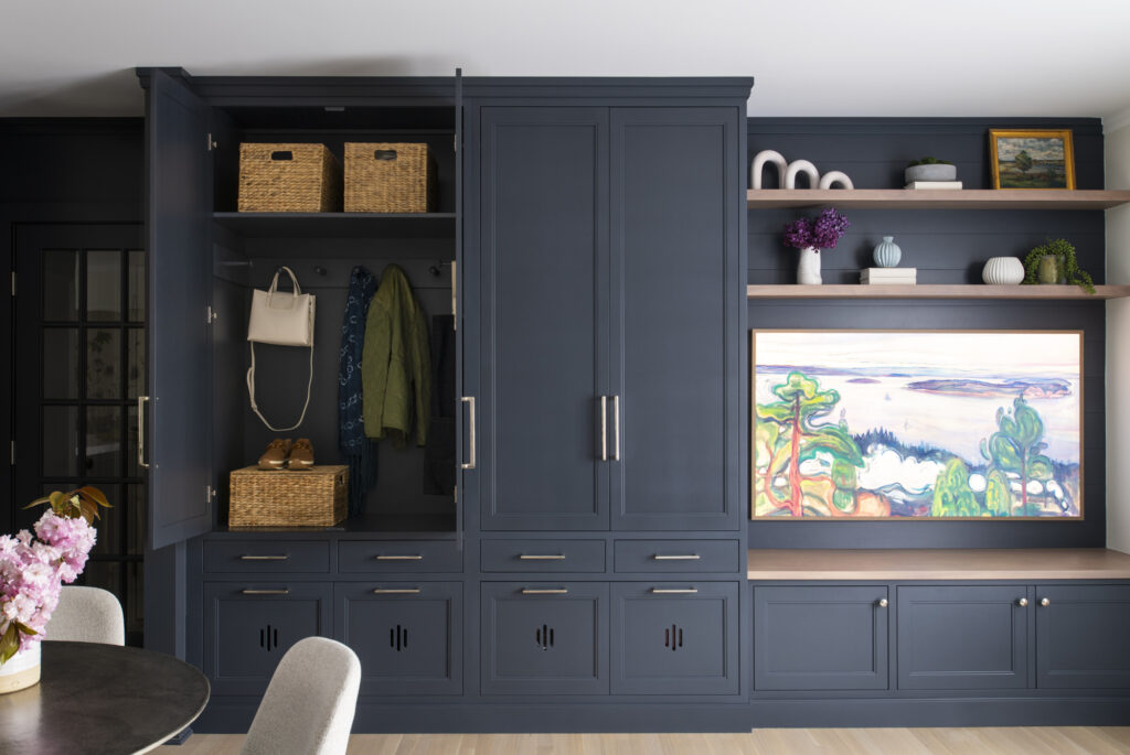
Because the small mudroom leads into the family room now, we added dedicated cabinetry for coats, jackets, shoes, and all of the things you need to get out of the house in the morning. This offers up more storage (something every young family needs) right within arms reach, no matter what door you are exiting from.
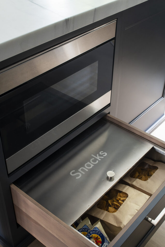
And what young family (or any family for that matter) doesn’t need a special area for snacks right near the back door? I love incorporating drawers like this into my designs, making things easily accessible to all members of the family no matter how young or old, and keeping everything tucked away and fresh.
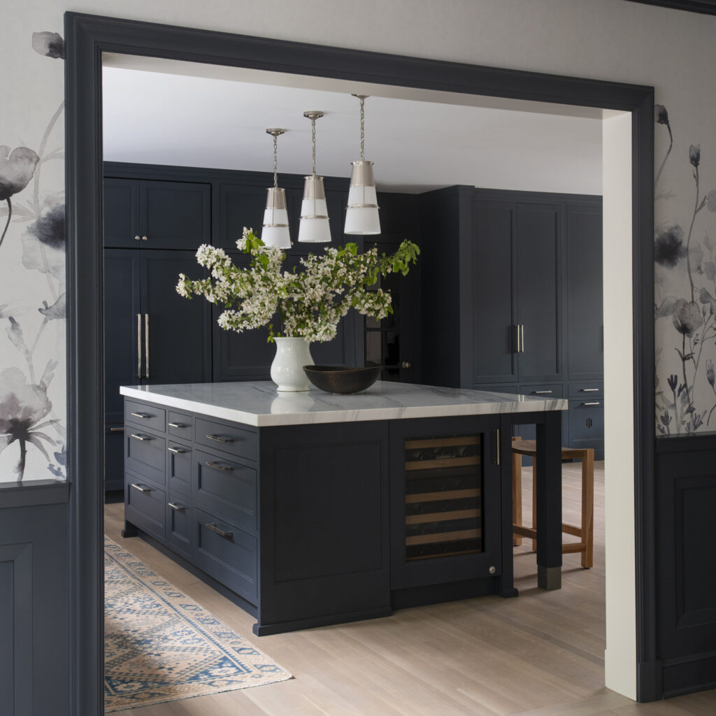
This view is looking from the dining room into the kitchen. We tied the off-black color of the cabinets into the millwork in the dining room, which is a shade lighter. We encouraged the homeowner to complete the look with this beautiful floral mural by Philip Jeffries. It is dramatic yet soft, and you can almost hear the flowers rustling in the breeze!