A Kitchen Tour of “The Joy is in the Details”
A move from the city prompted this young family to tackle a quick but thorough kitchen and dining area renovation. As avid cooks who love to entertain, the couple wanted a dose of glamour without giving up any of the functionality of this multi-purpose space. Hosting large family gatherings frequently, the kitchen needed distinct zones for prep, cooking, casual meals, and serving guests.
They quickly found that their existing kitchen, although relatively new, didn’t suit their needs in terms of function or style. Reaching out to us for a remote consultation, they quickly discovered that they wanted our team to handle the kitchen renovation from start to finish – and this blue beauty was the end result!
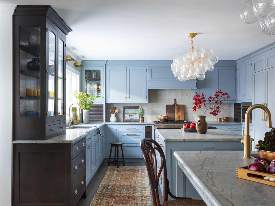
The homeowners love color and are avid Instagram followers. We found that their pinboard was full of kitchens with saturated blue cabinetry so that is how we selected the color palette. This is a color match to a Benjamin Moore gray blue that is so popular, it goes by three different names in their Classic, Historic, and Aura color collections. This color is included in our Favorite Blues Ebook!
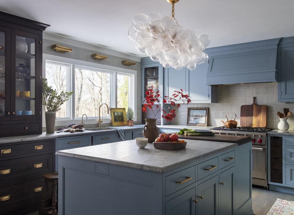
Because the family loves to cook it was important to create a lot of prep space in the design. The team added not one, but two islands as seen here for this purpose. The kitchen was quite long, and although we wanted to maximize the island size, we wanted the ability for traffic to be able to cross from one side of the kitchen to the other.
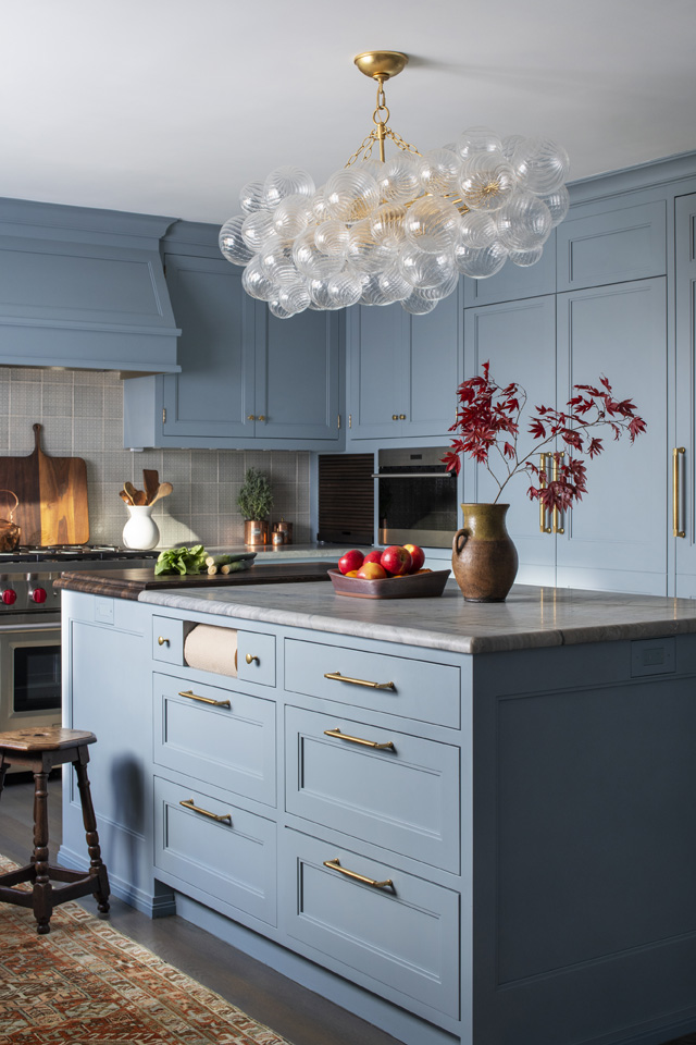
Each island has custom storage solutions. In this island, there is a paper towel holder built in as well as drawers with spaces for cutting boards, baking sheets, utensils, knives, and more. There is a place for everything helping to keep the prep space clear and the kitchen tidy.
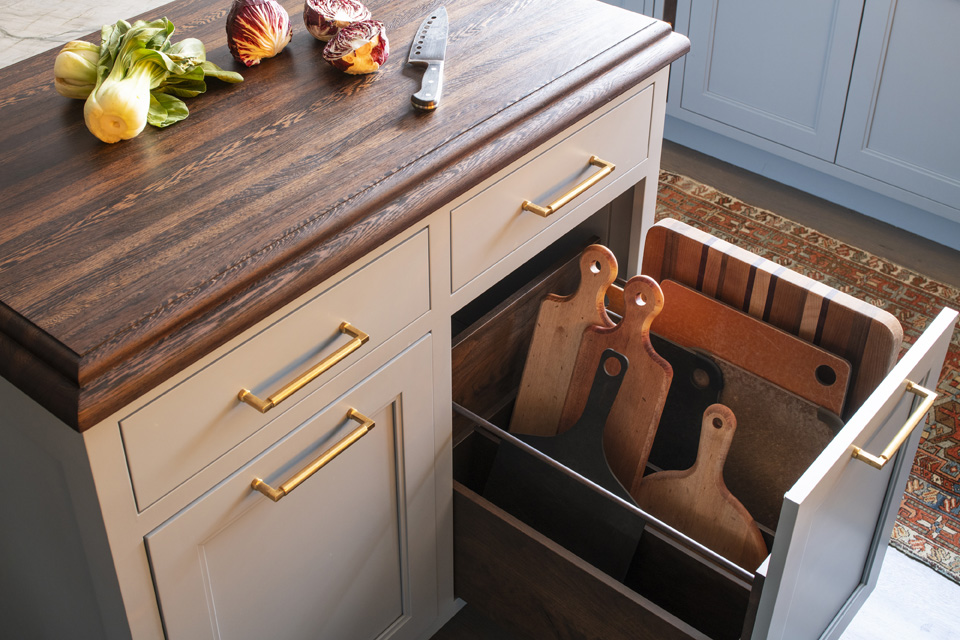
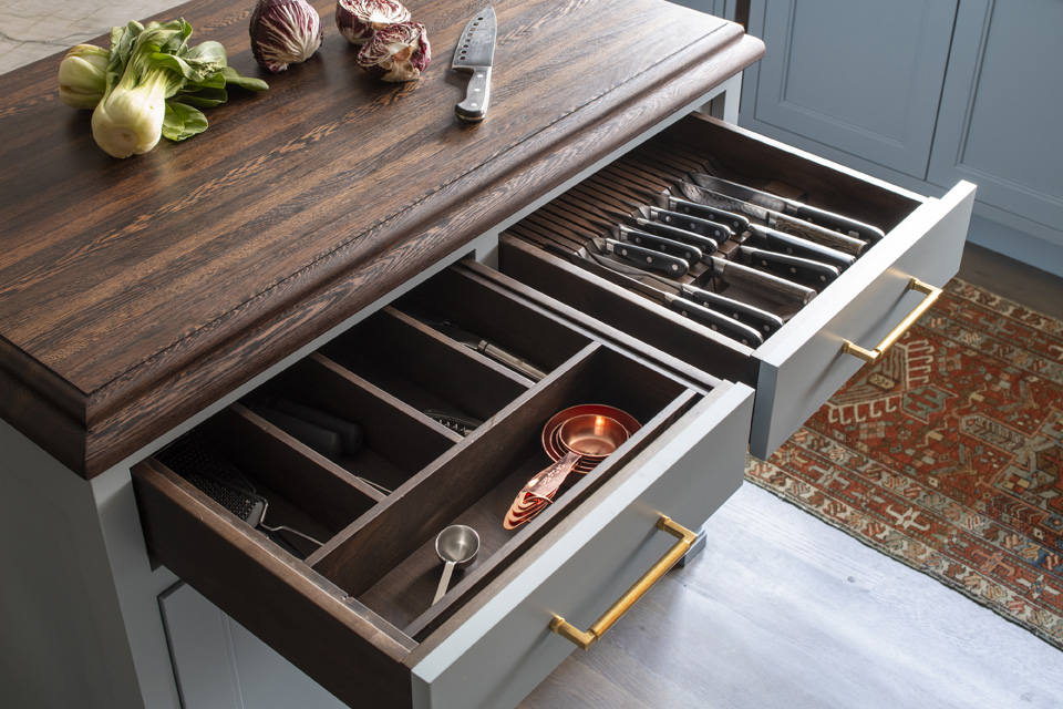
In addition to the storage within the islands, there is plenty of customized storage within the outer cabinets as well. The homeowners wanted to maximize the storage and functionality of their kitchen while incorporating luxury finishes and plenty of room for the family to gather.
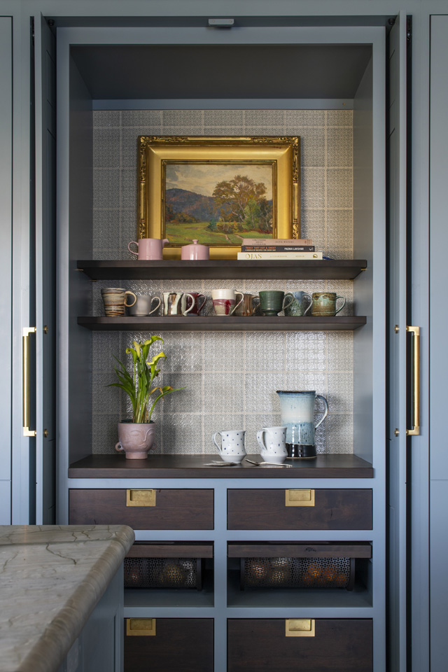
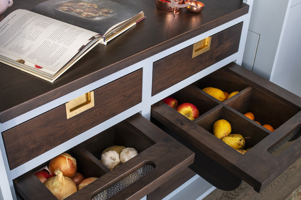
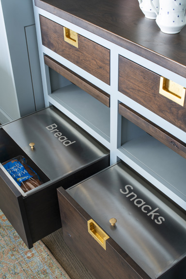
The breakfast pantry creates a home for coffee, tea, toast, bread, cereal, and a spot to prepare all those things. It’s more of a functional space, less of a storage space than a traditional, tall pantry. This breakfast pantry features shelves and drawers to hold everything needed to make a cup of coffee or tea in the morning and serve breakfast. The drawers include vented produce drawers for fruits and vegetables while the bottom drawers hold snacks and bread.
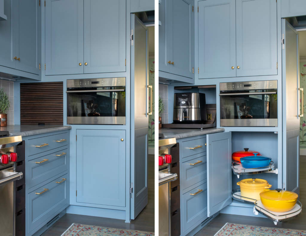
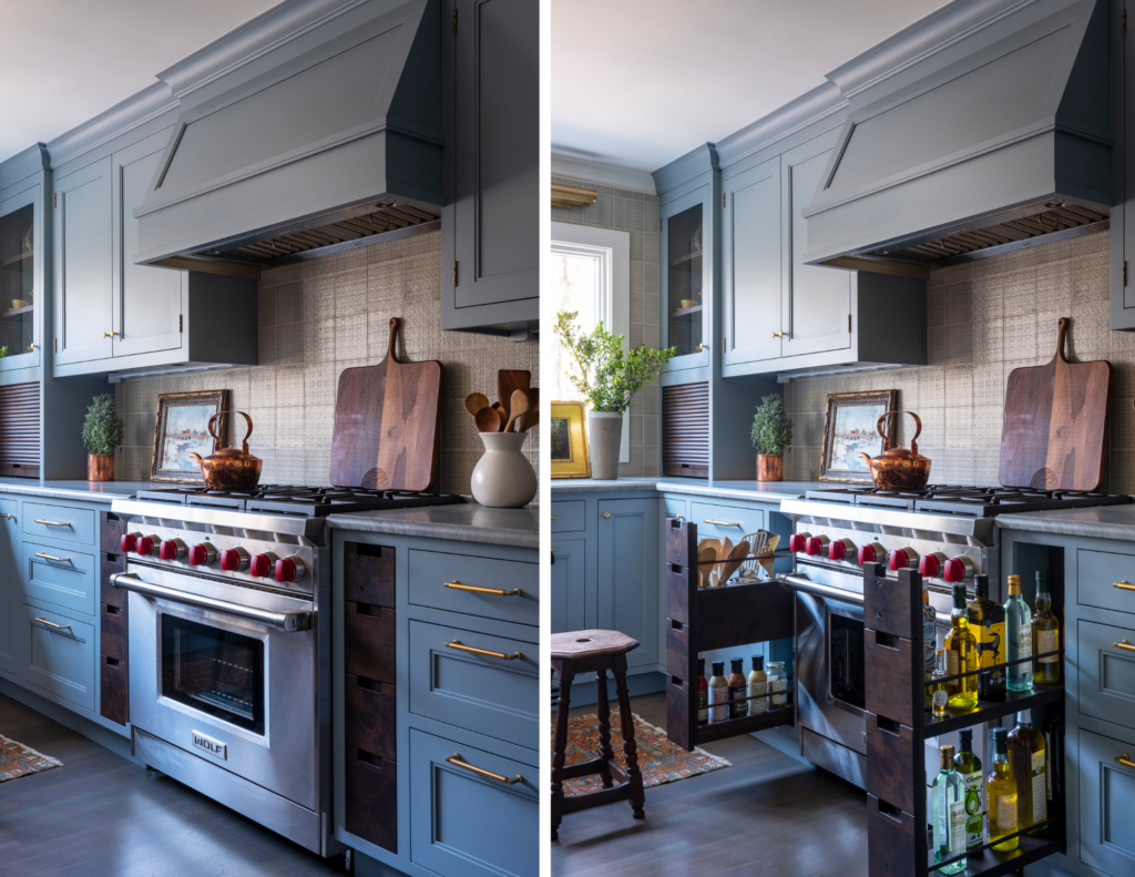
In addition to the breakfast pantry, we spent a lot of time perfecting the corner storage near the range. There is a LeMans in the base cabinet that pulls out for maximum storage and ease of access plus an appliance garage to keep smaller appliances off of the counter and out of sight. There are also pullout cabinets for oils next to the range to have everything you need for cooking within reach.
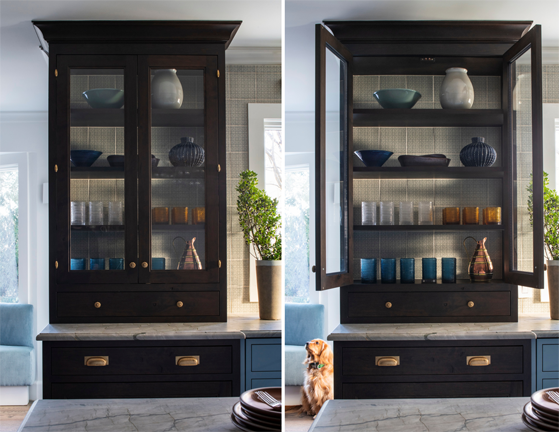
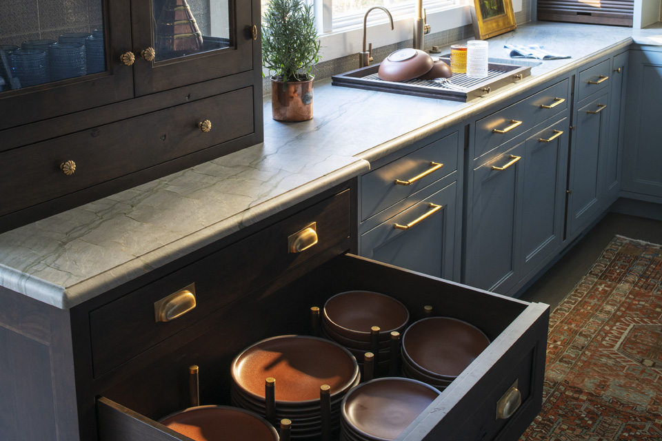
In addition to these hidden storage solutions around the kitchen, there is also a built-in china cabinet with glass doors to keep all of the homeowner’s serving pieces on display. Below the glass cabinet are deep drawers with dish dividers to store everything the homeowner needs to set a beautiful table. We really focused on incorporating plenty of storage in this kitchen with the appliance garage, the beautiful china cabinet, island prep storage, and the breakfast pantry.
There are so many beautiful details in this kitchen, but one of my favorites is the hidden doors that pass from the kitchen to the dining room seen here. We worked hard on the design so the doors would look beautiful whether open or closed.
The Team:
Kitchen Design: Sarah Robertson, Studio Dearborn
General Contractor: Dalton Gordon, DG Construction Service
Photography: Adam Kane Macchia
Styling: Studio Dearborn