In the Midnight Hour
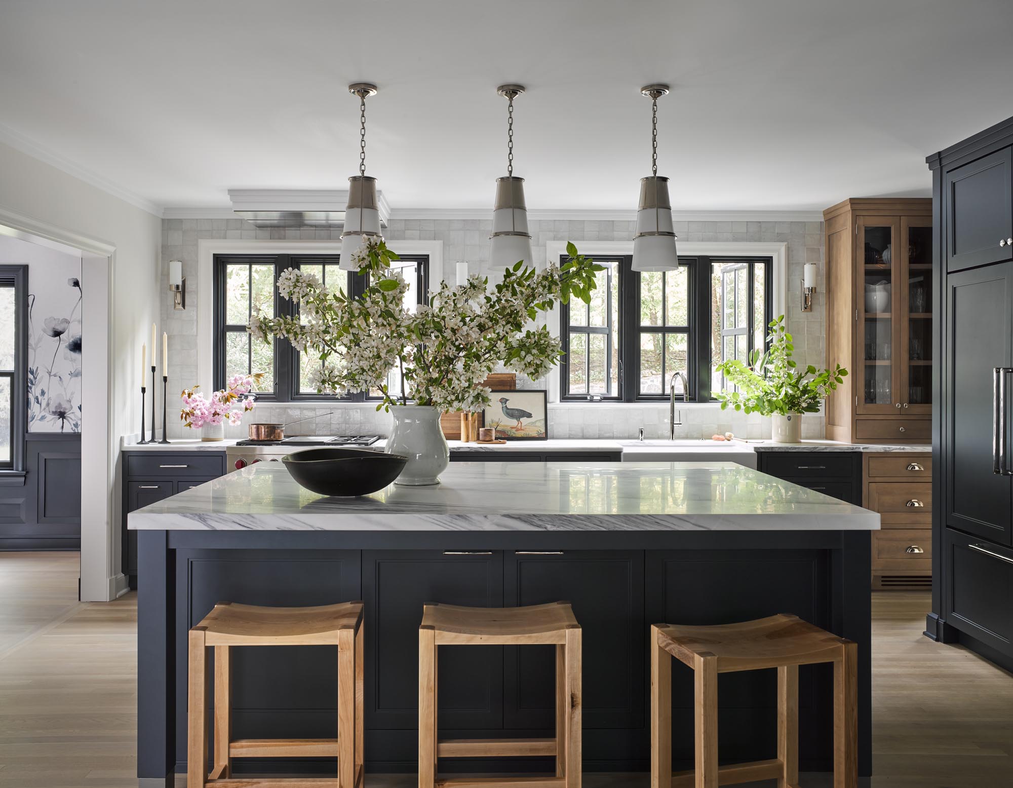
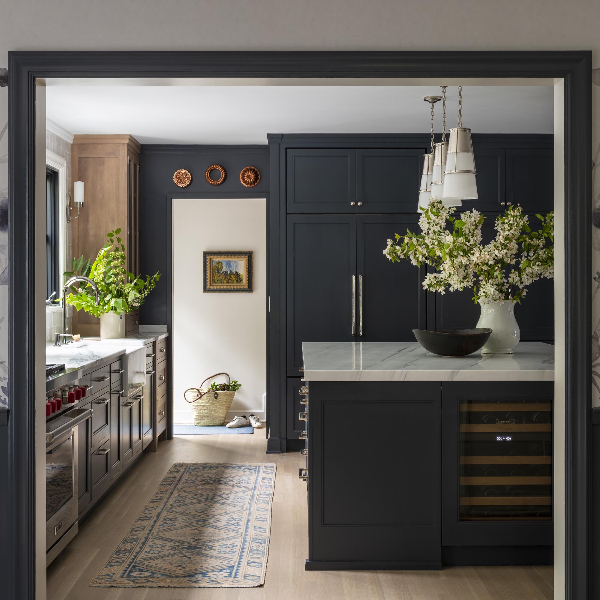
What once was a cramped and dark kitchen (complete with an awkward brick wall and pizza oven) is now a light, open, family-friendly space that has plenty of storage and prep space.
Along with the help of architect Jaclyn Tylor of Tyler Architecture, a load-bearing wall was removed to create a more open flow, and large windows were added to let more natural light into the space.
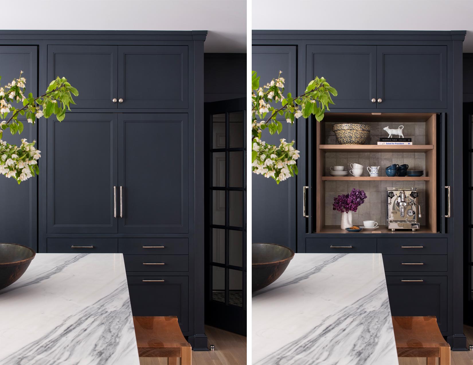
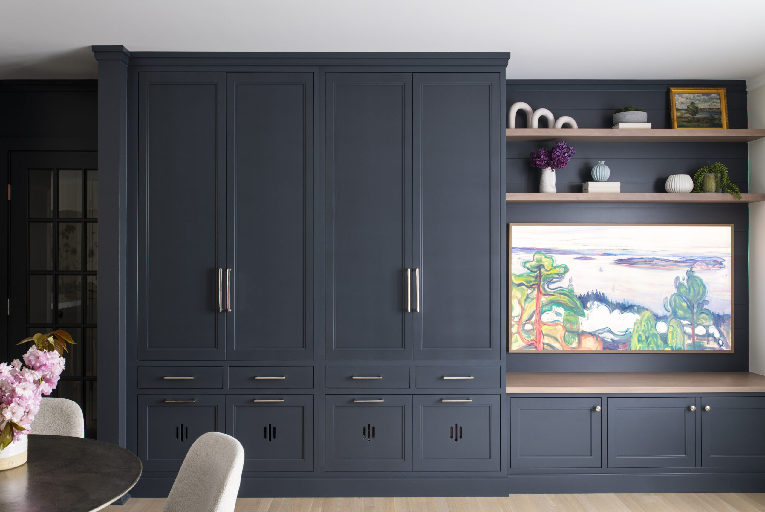
We chose an off-black with a tint of blue for the cabinets. We felt it was a gorgeous contrast with the pale oak floors. We also brought in a similar pale birch for the china cabinet. We chose birch instead of white oak because it is a plentiful and fast-growing species and a bit less expensive.
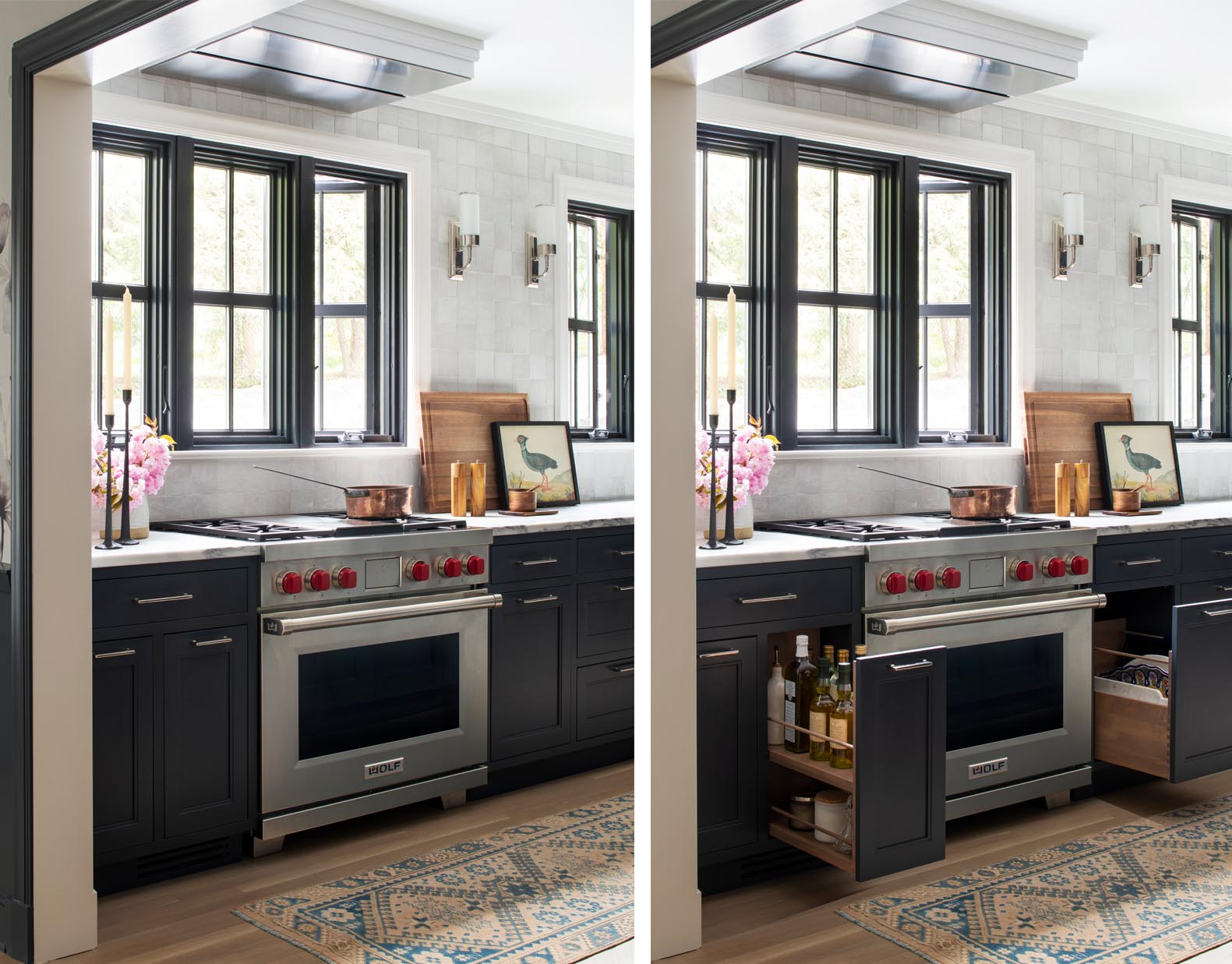
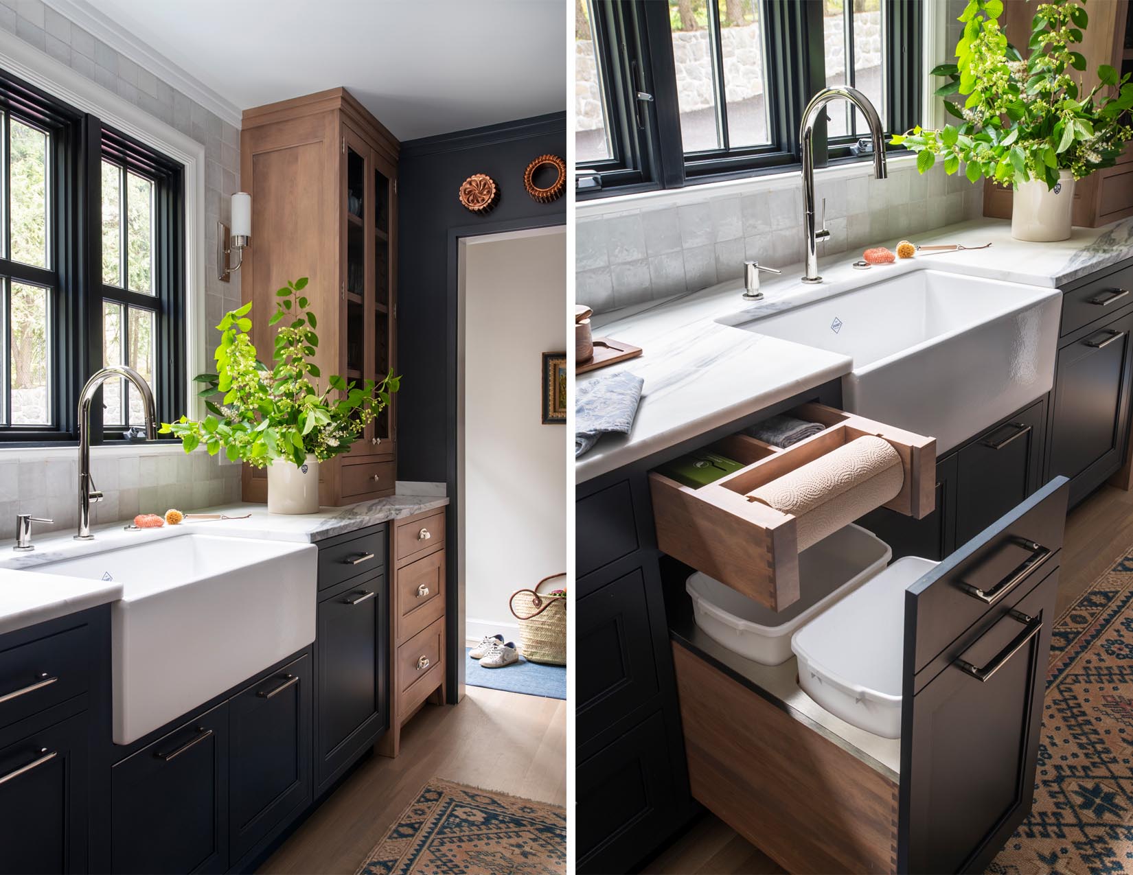
There are also several “zones” for prepping and cooking and don’t forget the all-important coffee station. Overall there is plenty of storage for everything and there is a unique ceiling ventilation system to keep the symmetry with the sink area.
